Animation
Facing addiction together
A university student journey through trying drugs, becoming reliant on them and then choosing a healthier path when FRANK helps them, they realise they have an addiction. This is to show how easy it is to fall into drug addiction when a university student starts to make their own adult decisions.
The challenge
The goal of this project is to take a piece of text and transform it into a dynamic animation sequence, using the skills we learnt in workshops. By blending motion graphics with the essence of the chosen text, we aim to bring the context to life, enhancing its meaning and impact through creative movement and visual storytelling.
Chosen text
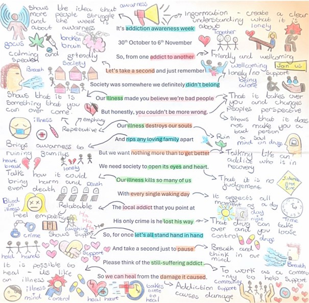
We were deeply moved by the powerful insights shared on FRANK’s addiction awareness website, which helped us realize that addiction is a complex illness, not a moral failing. It became clear to us that people struggling with addiction aren’t necessarily to blame for the path they’ve found themselves on—they need help, not judgment. The piece we read was written by someone in recovery, and their words were raw and impactful. It set us on a clear path to raise awareness in a compassionate, non-judgmental way—one that would invite conversation, not alienate.
One sentence resonated with me deeply: "Society was somewhere we definitely didn’t belong, our illness made you believe we’re bad people." This powerful statement made me realize that addiction is often misunderstood as a character flaw when it’s an illness that requires empathy, not condemnation. It broke my heart to think that addicts might view themselves as “bad people,” when, in fact, they’re simply individuals who’ve made unfortunate choices due to a lack of support and resources. I believe part of the problem is a lack of understanding about substance abuse—many people simply don’t know how deeply it affects someone’s life.
That’s why we wanted to focus on educating young adults as they begin their independent journeys. By providing this knowledge early on, we hope to help prevent individuals from falling into the cycle of addiction and offer support to those who may need it. Our goal is to encourage open-mindedness and create a space for understanding, not judgment.
Initial experiments
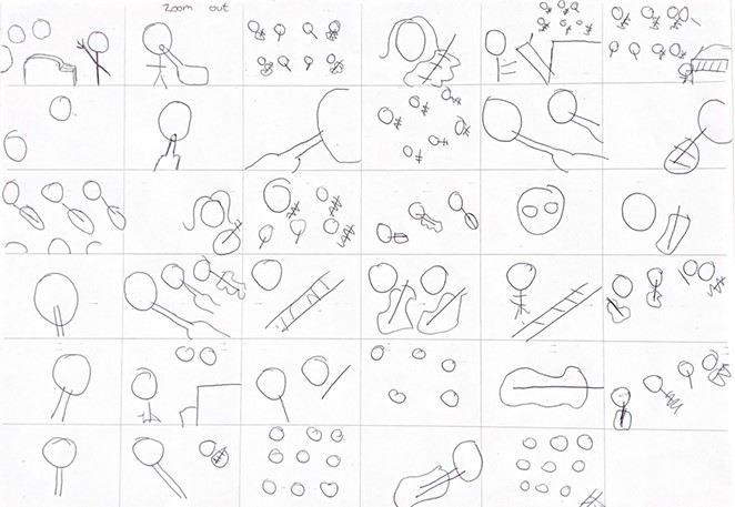
In this workshop, we dove into capturing the dynamic movements of each scene from a piano performance. We learned the art of sketching quick storyboards, which helped us map out our first rough drafts. This process sparked our creativity, encouraging us to experiment with different camera angles and see how each perspective could shape the viewer's experience. By varying the shots, we learned how to keep the audience engaged and draw their attention to the fluid motion, all while adding depth and intrigue to the story.
Stop motion tests
We kicked off by creating our very own stop-motion animation, starting with the simple yet fascinating journey of a bouncing ball. Watching the ball drop and bounce taught us the fundamentals of movement, while carefully placing each drawing to ensure smooth transitions. It was a hands-on way to truly understand how each frame works together to bring something to life!
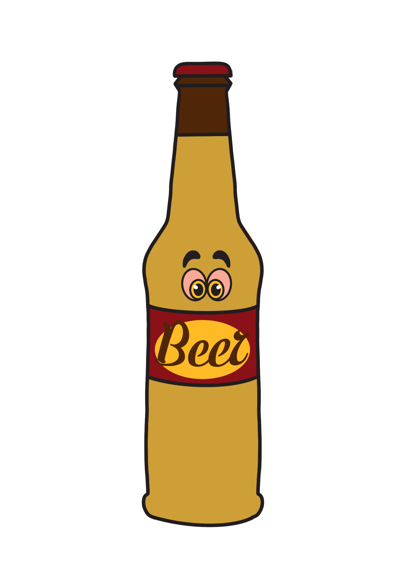
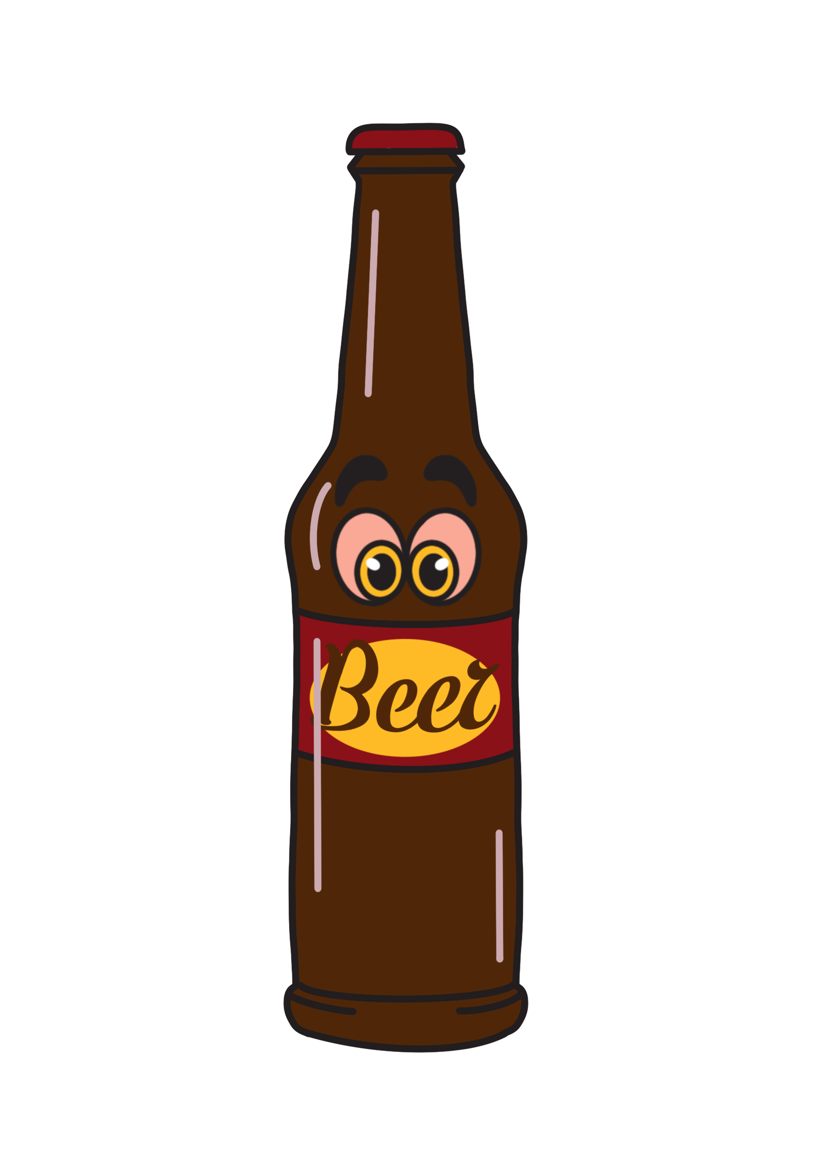
We expanded our animation journey by diving into the basics of stop motion. Using playdough, we crafted our very first stop-motion animation, where we explored the subtle movements needed to bring a character to life. Our focus was on creating a smooth, realistic flow of a man drinking a beer, paying attention to every tiny detail. The process was not only fun but also eye-opening as we learned how to make our animations feel lifelike and engaging!
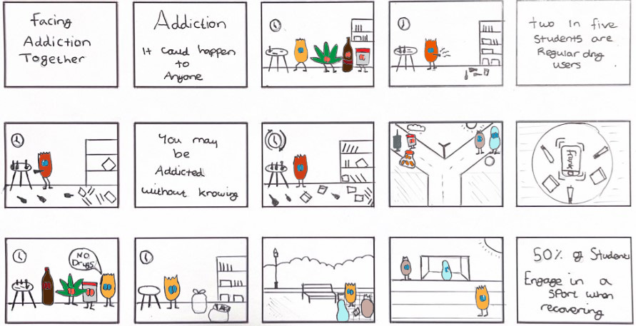
Our storyboarding
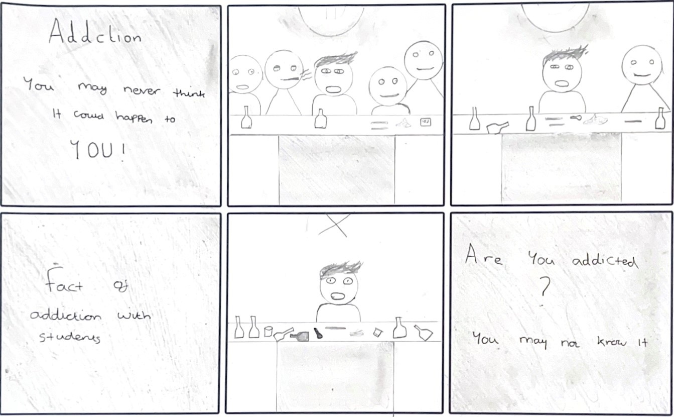
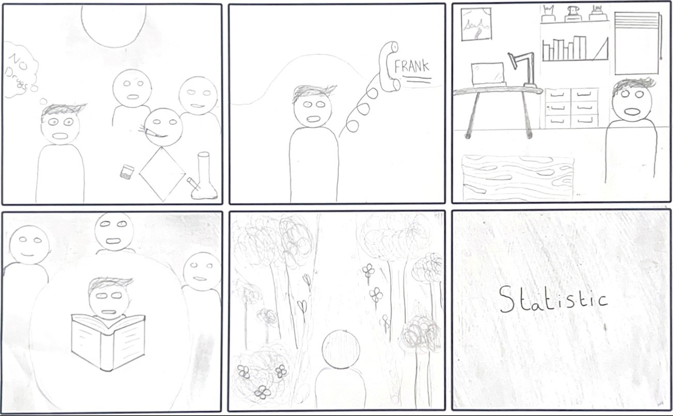
We focused on the issue of drug addiction among university students, aiming to raise awareness of how easily one can slip into addiction and the importance of supporting friends who may be struggling. Our initial storyboard was set at a party, where a student is offered drugs, sparking a cycle of continued use at every social gathering. This gradually leads to using drugs alone, highlighting the emotional toll and the turning point were seeking help, like calling the charity FRANK, becomes a lifeline for change. We expanded on this idea by exploring the various paths an addict might take, showing that addiction doesn’t just affect the individual, it impacts their entire life.
To further engage our audience, we incorporated powerful statistics designed to resonate with students, helping them understand that addiction is more common than they might think, and there’s no shame in seeking help. Inspired by a TED Talk I watched, which discussed how addiction is spreading among younger students and the dangerous influence of peer pressure, we used these insights to craft a compelling and thought-provoking animation. Our aim was to create a lasting impact, urging students to consider the potential consequences of relying on drugs and reminding them that addiction is preventable with awareness and support.
Choosing our music
We wanted to create most of our audio from scratch to really capture the vibe we envisioned for the animation. For the party scenes, we aimed for a transition in the music—from upbeat party tracks to harder, more intense beats, which then shifted into calming, soothing melodies when the main character decides to turn things around. To bring this vision to life, we used a mix of our own recordings and copyright-free audio we found. Some of our own tracks weren’t quite up to the quality we hoped for, so we supplemented with high-quality sounds to ensure everything flowed seamlessly. The equipment provided by our tutor in the workshop really helped elevate the overall sound quality.
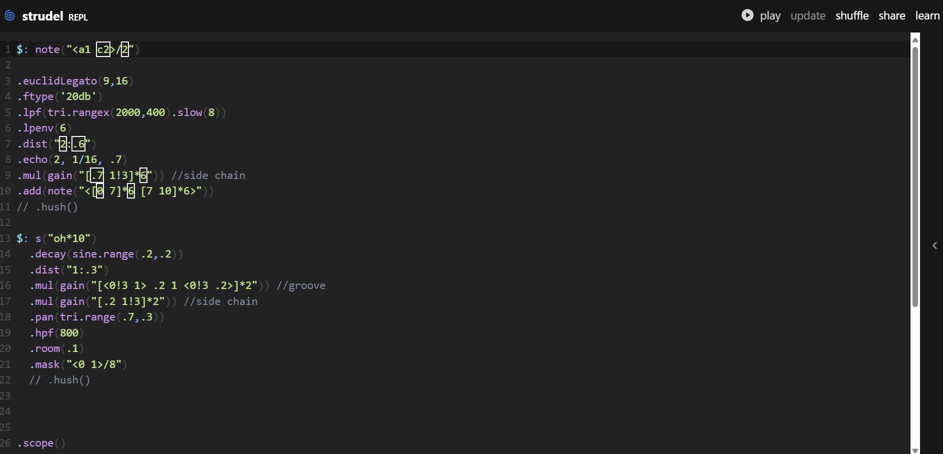
I took on the task of creating the party music, drawing inspiration from Mark’s audio workshop on strudel. I crafted both the chilled party vibe and the base for the more intense party scene. This experience pushed me to develop my music production skills, experimenting with different sounds until we found the perfect fit for each scene. If we had more time, I would’ve loved to create our own original calming music to accompany the moment when the main character chooses a better path.
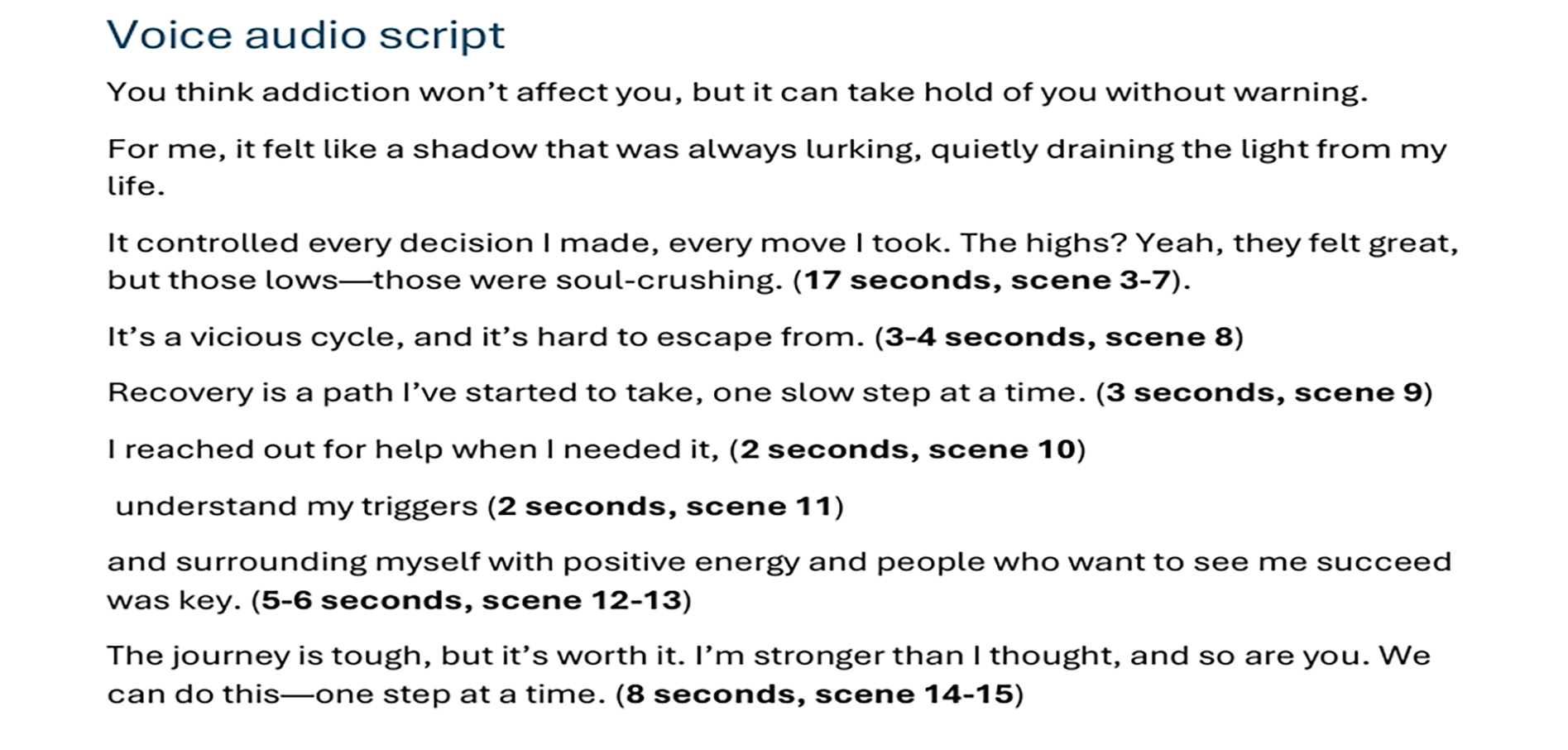
For the voiceover, we decided to use a classmate’s deeper voice, as it had a more fitting tone for the video than my own voice. After feedback from our presentation, we realized the deeper voice helped convey the gravity of the situation more effectively. I wrote the voiceover script, drawing inspiration from the text we had chosen, which allowed us to create a script that truly aligned with the message we wanted to communicate.
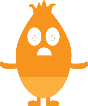
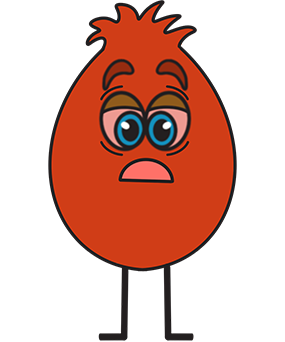
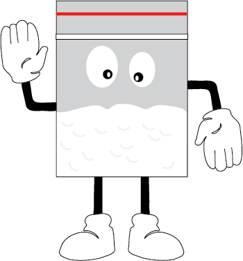
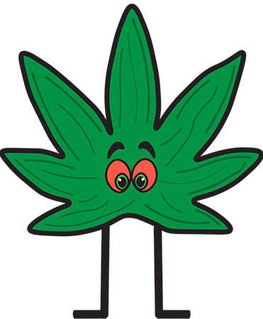
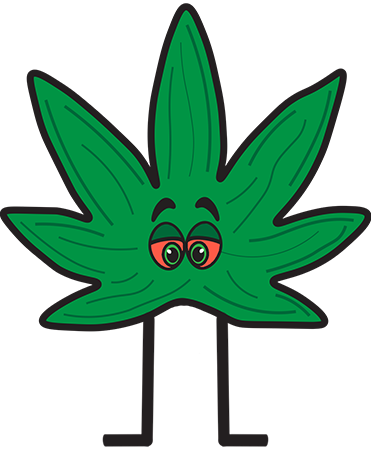
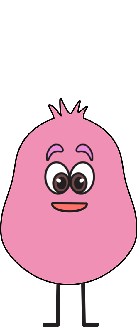
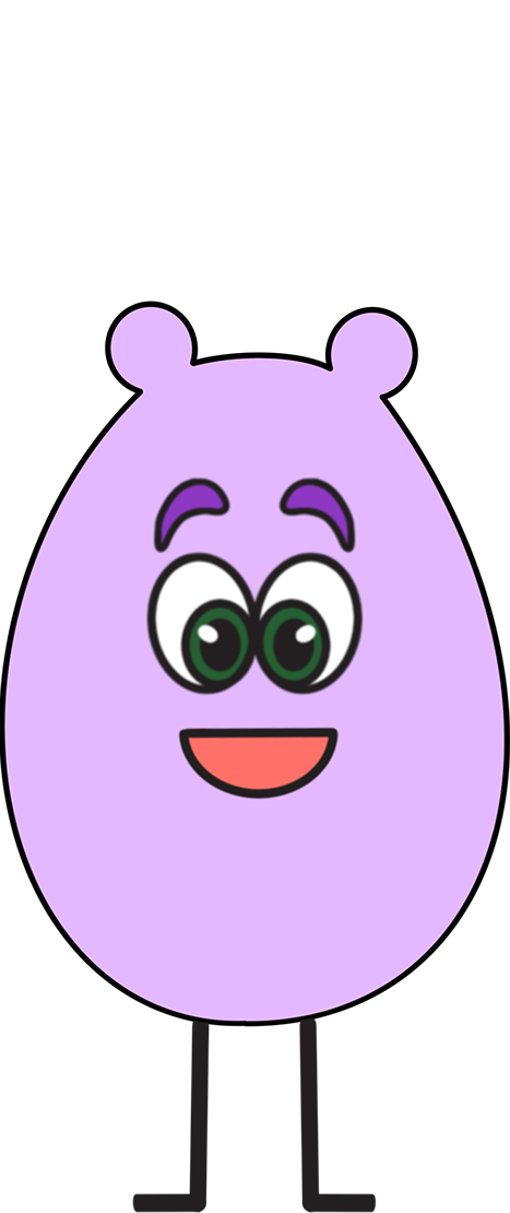
Initial character drawings
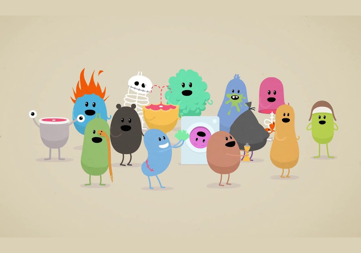
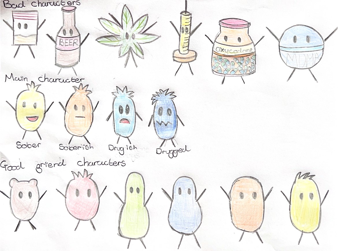
Here are the character drawings that initially inspired our vision for the final designs. I created these sketches to give my teammates a clear idea of how the characters would look. Drawing inspiration from the quirky and fun style of "Dumb Ways to Die," I aimed to make these characters relatable and humorous for our target audience, ensuring they connect with the animation in a lighthearted and engaging way.
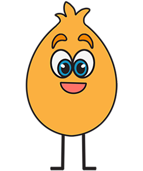
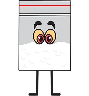
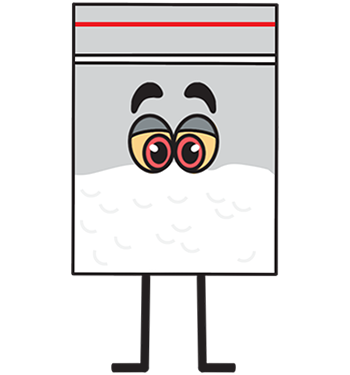
Our character development
For inspiration, we turned to the quirky characters from Dumb Ways to Die, aiming to create playful, funny designs that would resonate with our target audience. We wanted the characters to have a light-hearted, humorous tone so the message would stick, encouraging viewers to reflect on the issue of addiction without feeling like they were being lectured. The goal was to show them that it’s not about being told what to do but about offering support and options when they or their friends are struggling, which aligns with the mission of our chosen charity.
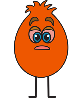
We began by brainstorming the visual style for each character, ultimately evolving the designs to give them a cohesive look. A major shift came after receiving feedback during our presentation: our main character initially looked too different from the others. We realized that to show the stark contrast between a sober individual and one affected by drugs, we needed to visually represent the gradual change. We decided to have the main character subtly transform as they use more drugs, highlighting how addiction impacts a person over time. It was important to show that while drugs might seem fun at first, the reality is that they stop giving the same thrill once you become reliant on them.
As we refined our characters, we decided to have them all share similar features, same eyes, eyebrows, and legs. This visual consistency helped guide the design of the secondary characters, especially the friends, as we focused primarily on developing the main character and the “bad” characters. This approach ensured our designs felt unified and reinforced the narrative we wanted to tell.
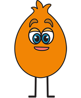
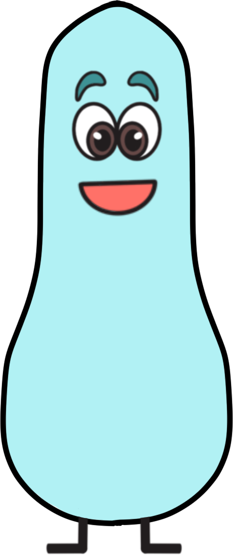
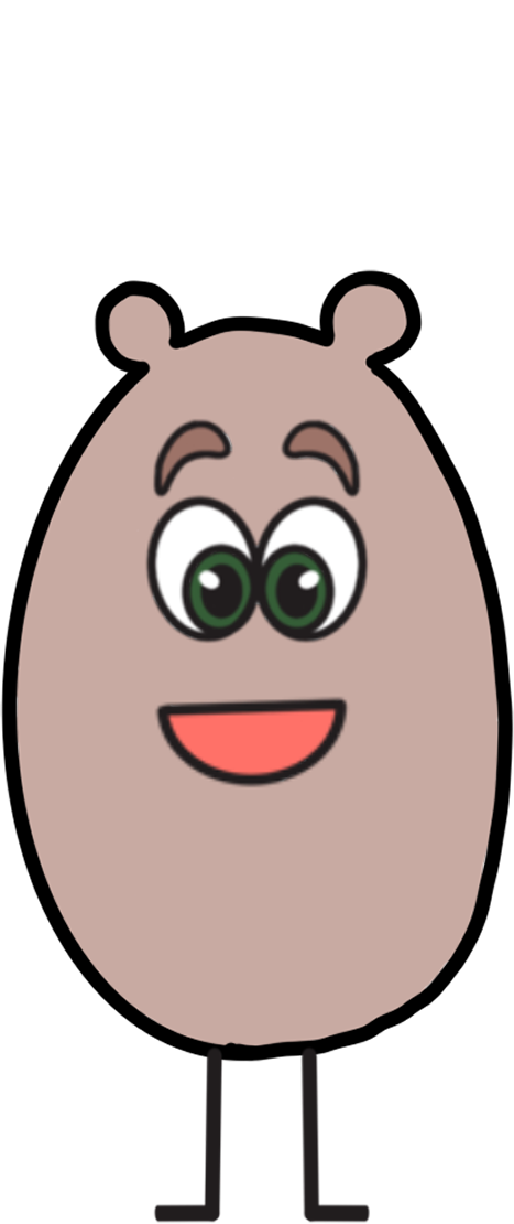
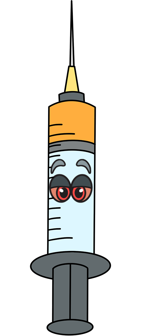
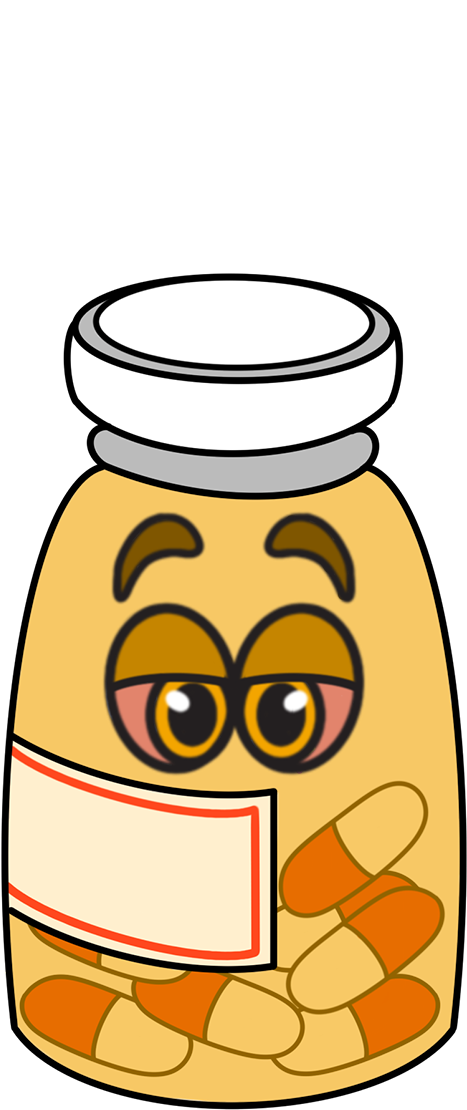
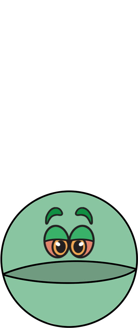
Our other characters
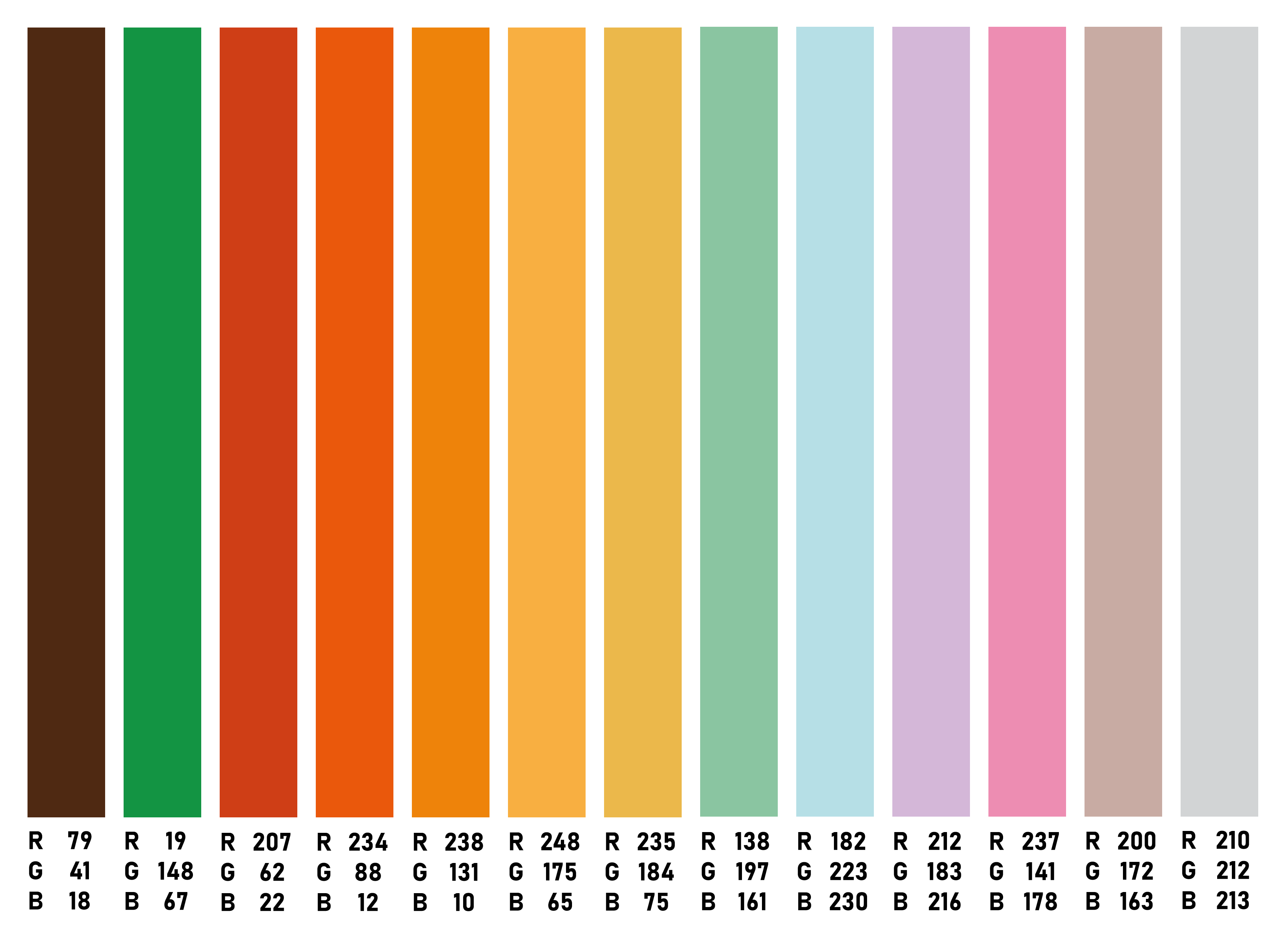
Our colour swatches of all characters
Our context
Our animation is designed with university students in mind, particularly those aged 18-24, though it’s relevant for students of all ages. For many, university is the first time they’re living away from home, marking the beginning of their adult lives. We want to create an animation that guides them to make informed decisions during this pivotal time—decisions that can have a lasting impact on their future.
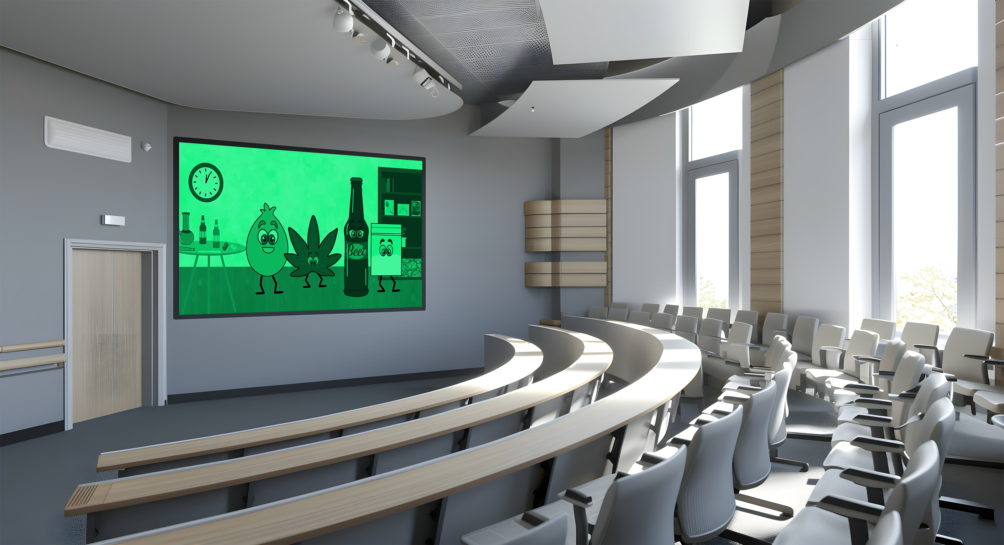
Our goal is to have this animation featured in lectures, on FRANK’s website, and prominently displayed on university student support pages. By showing it in lectures, we aim to make it both memorable and engaging, using humour to grab attention while still delivering an important message. We envision this being shown at the start of the academic year to remind students of the warning signs of addiction and the risks they face as they navigate their new independence.
Through this animation, we hope to foster a deeper understanding of addiction, ultimately reducing the number of students falling into substance misuse. By doing so, we aim to contribute to a broader societal change, helping to lower addiction rates and improve the well-being of students across the country.
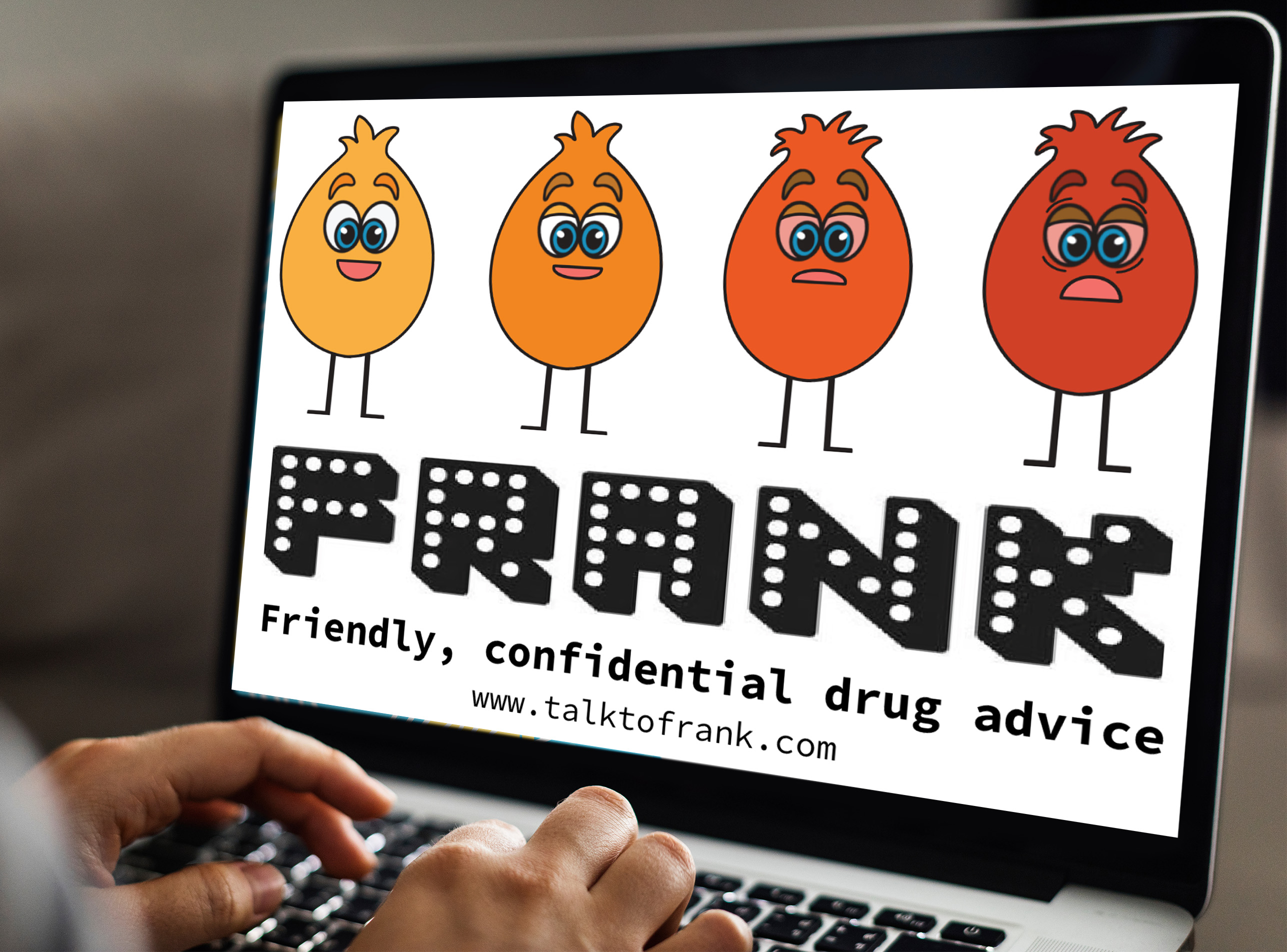
Our chosen charity
We aimed to design an animation that aligns with Frank's brand identity and core message. Frank’s website was a valuable resource in helping us select the appropriate text and write the voiceover script, which also guided the planning of each scene in the storyboard. Frank provides judgment-free support and advice for individuals dealing with drug-related issues. Their service offers information on drug misuse, treatment options, and harm reduction strategies, helping people understand the risks of drug use and connect with the right support. Frank’s mission is to educate, reduce stigma, and empower individuals to make informed decisions about their health and well-being.
Our storyboard animatic
We created an animatic to map out the timing, pacing, and overall flow of our animation. This allowed us to visually pinpoint areas that needed improvement and identify where specific audio elements would be most effective. The animatic served as a tool for gathering feedback, helping us determine which scenes required adjustments and where we could enhance the narrative. From this process, we learned the importance of refining the story structure to ensure a smoother progression and avoid unnecessary repetition, ultimately making the animation more dynamic and engaging.
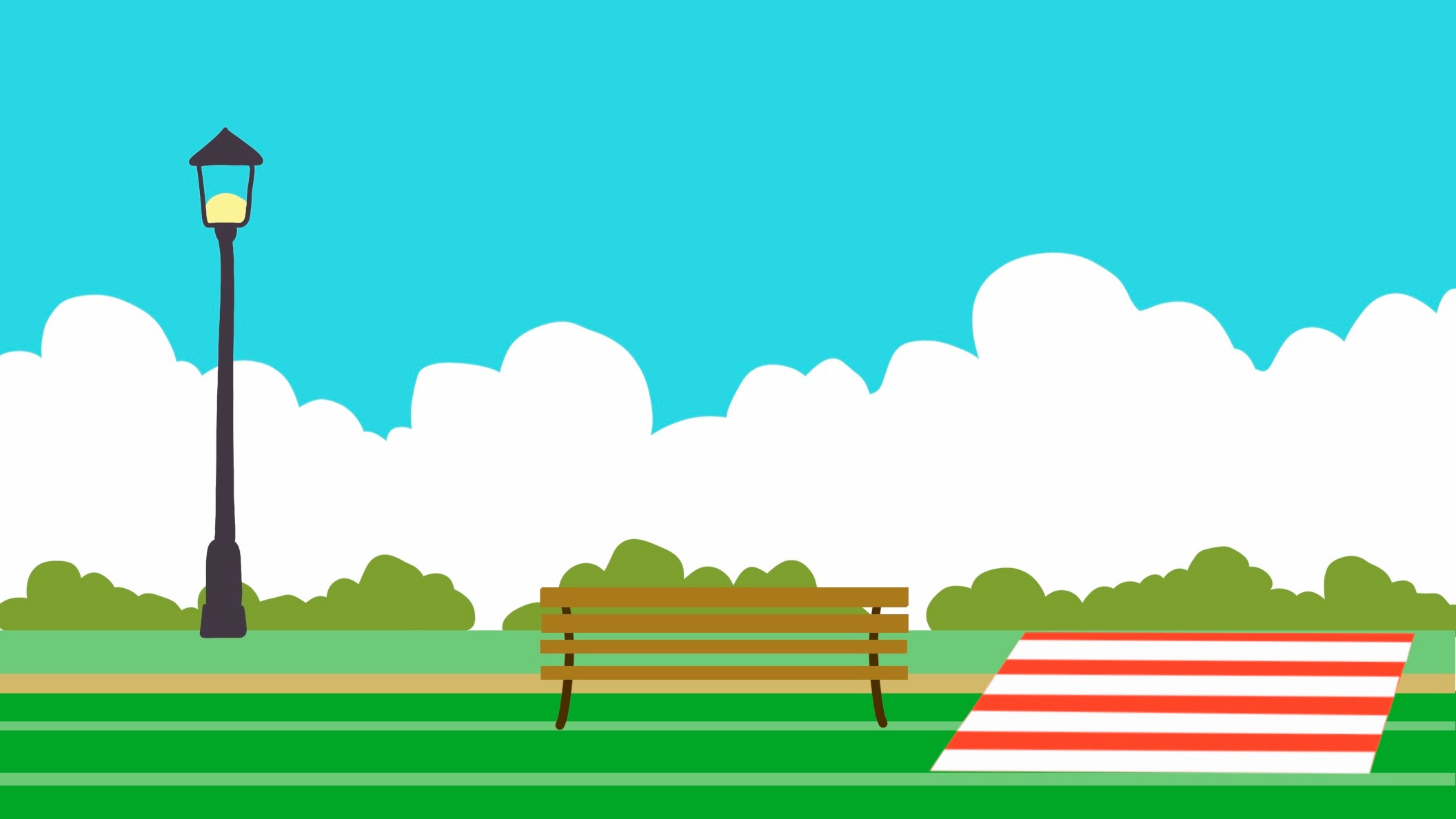
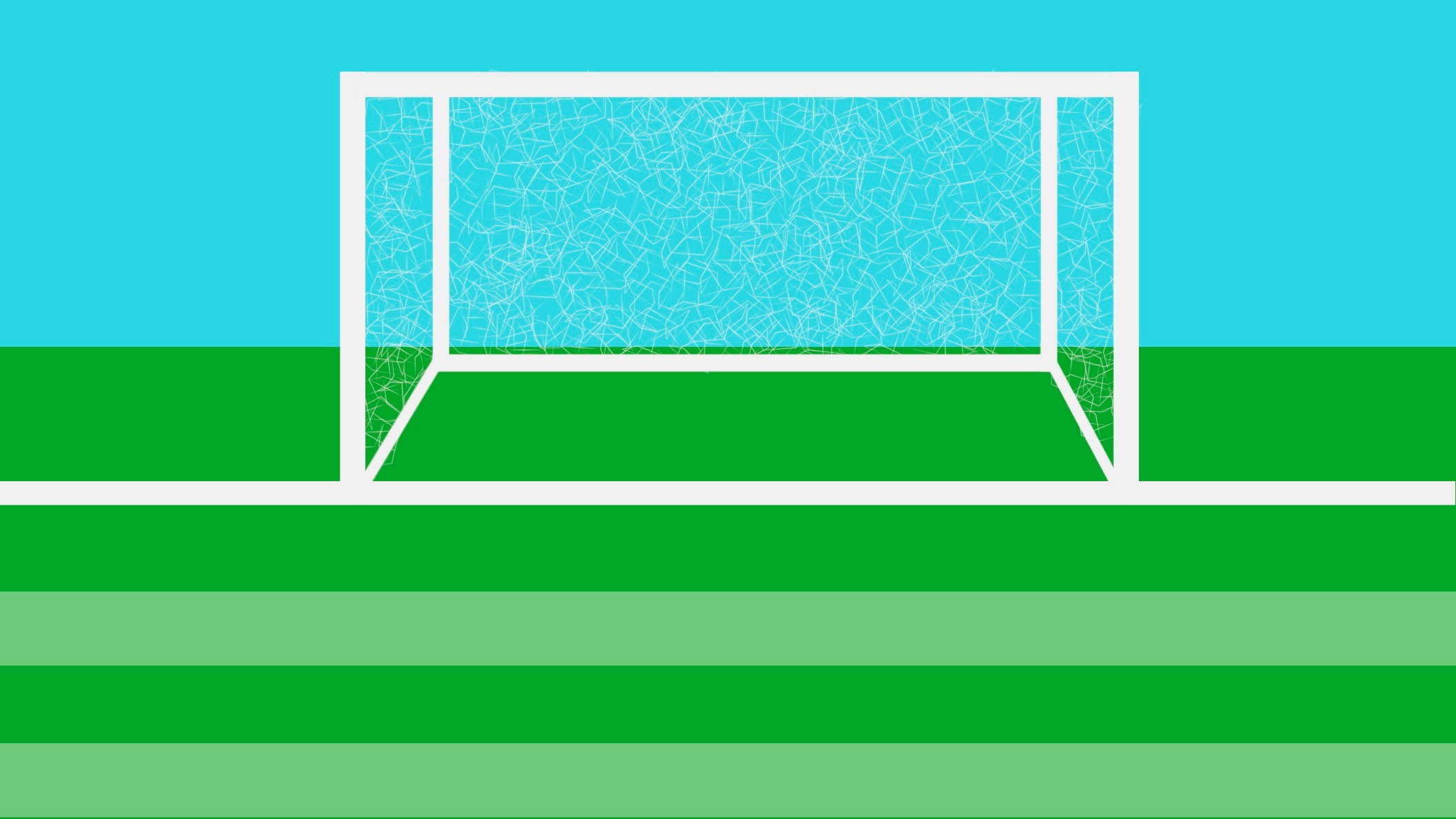
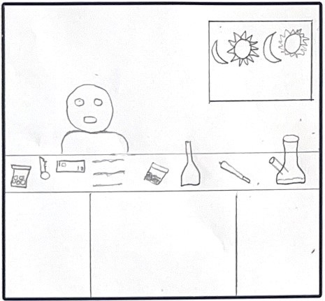
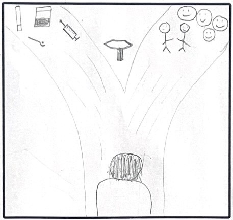
Our scenes
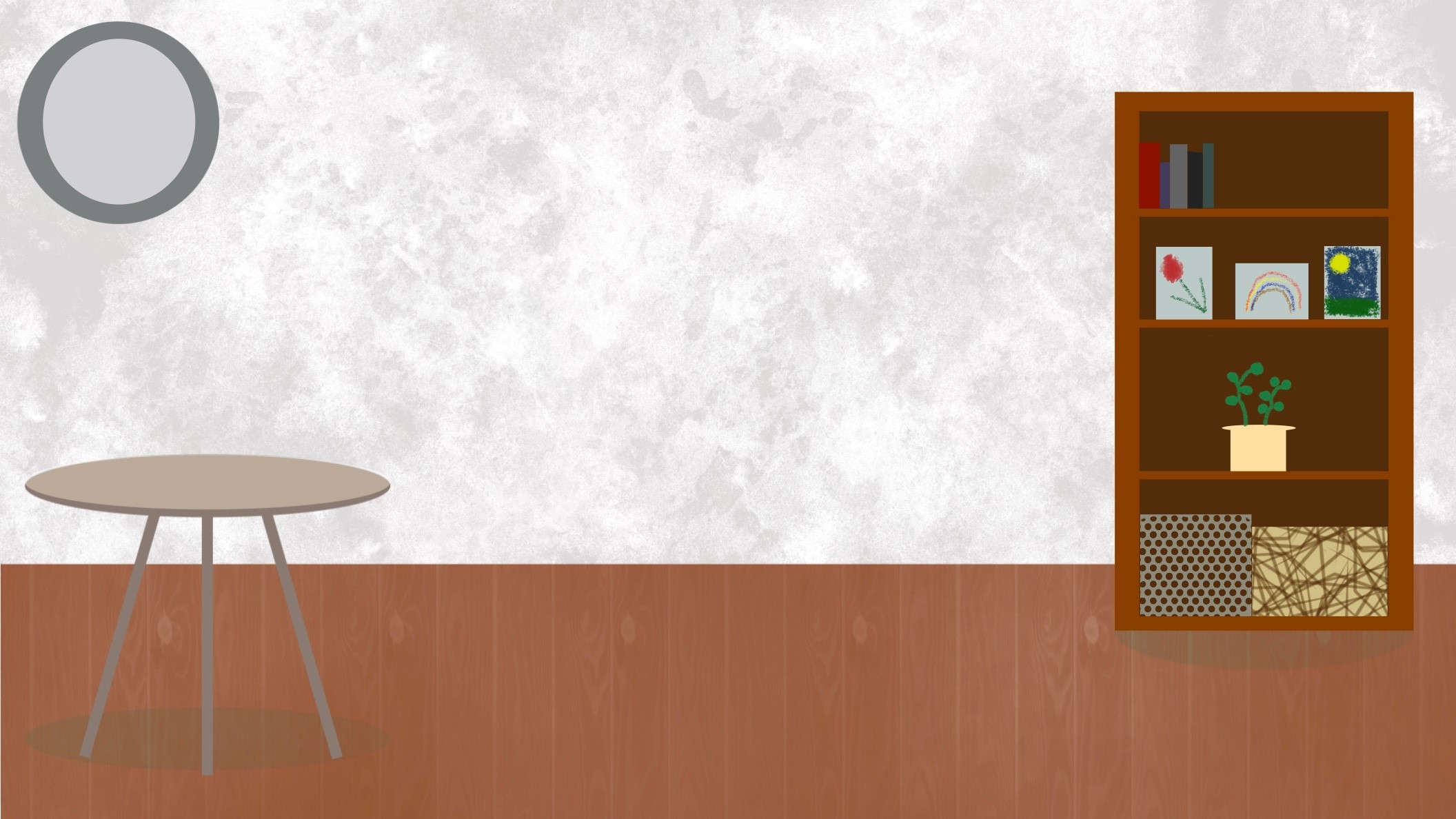
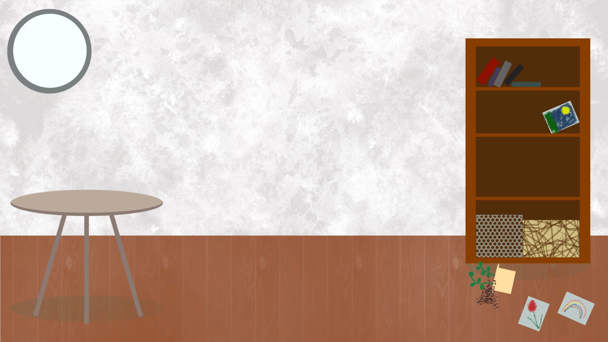
I drew out what will be the background of each scene, I designed all the background scenes apart from the pathway scene where my teammate designed it. I designed the background scenes on pro create, which was a new software I learnt during this project. This helped influence us with what needs to be on each scene to add more of an impactful meaning.
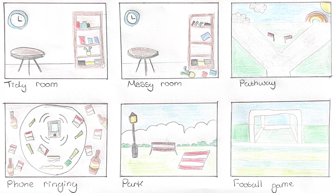
Our final storyboard
Our final storyboard was crafted to provide a vivid, clear visual representation of our animation’s flow. We outlined the appearance of each character, the key statistics we wanted to incorporate, and the updated scenes to give a full picture of how the story would unfold. Drawing from insights gained in our “Draw What We See” workshop, we understood the importance of repeating certain scenes for emphasis and rhythm. Additionally, by incorporating the feedback from each presentation, we refined the storyboard to ensure it didn’t feel repetitive. Instead, we made sure each scene flowed smoothly, reinforcing the idea of progress and helping the audience grasp the key message as the story moved forward.
Initial testing
My teammate was eager to explore how adding movement would transform the scene, experimenting with both the visual design and the fluidity of motion. Since this was our first time using motion graphics as a team, we were excited to test out different effects and see how they would bring the scene to life. My teammate took the lead in designing this initial concept on Procreate, though we knew this wouldn't be the platform for our final animation, as it didn’t quite achieve the polished look we were aiming for. Our goal was to make the scene feel as lively and authentic as a real-life party, to really capture the energy and vibe that would resonate with our target audience. This early exploration helped us set the stage for refining our animation to be both visually appealing and engaging.
My teammate designed the dancing characters, carefully illustrating their transformation from sober to drug-affected, giving us a quick visual reference for how the animation would flow. To refine the movement, we worked with a tech tutor to install software that allowed us to separate the characters' limbs, making it easier to animate the legs and other body parts independently. This was a crucial step in our process, as getting the character movement right would directly influence the fluidity and realism of the other scenes, ensuring consistency and a more dynamic visual experience throughout the animation.
Further testing
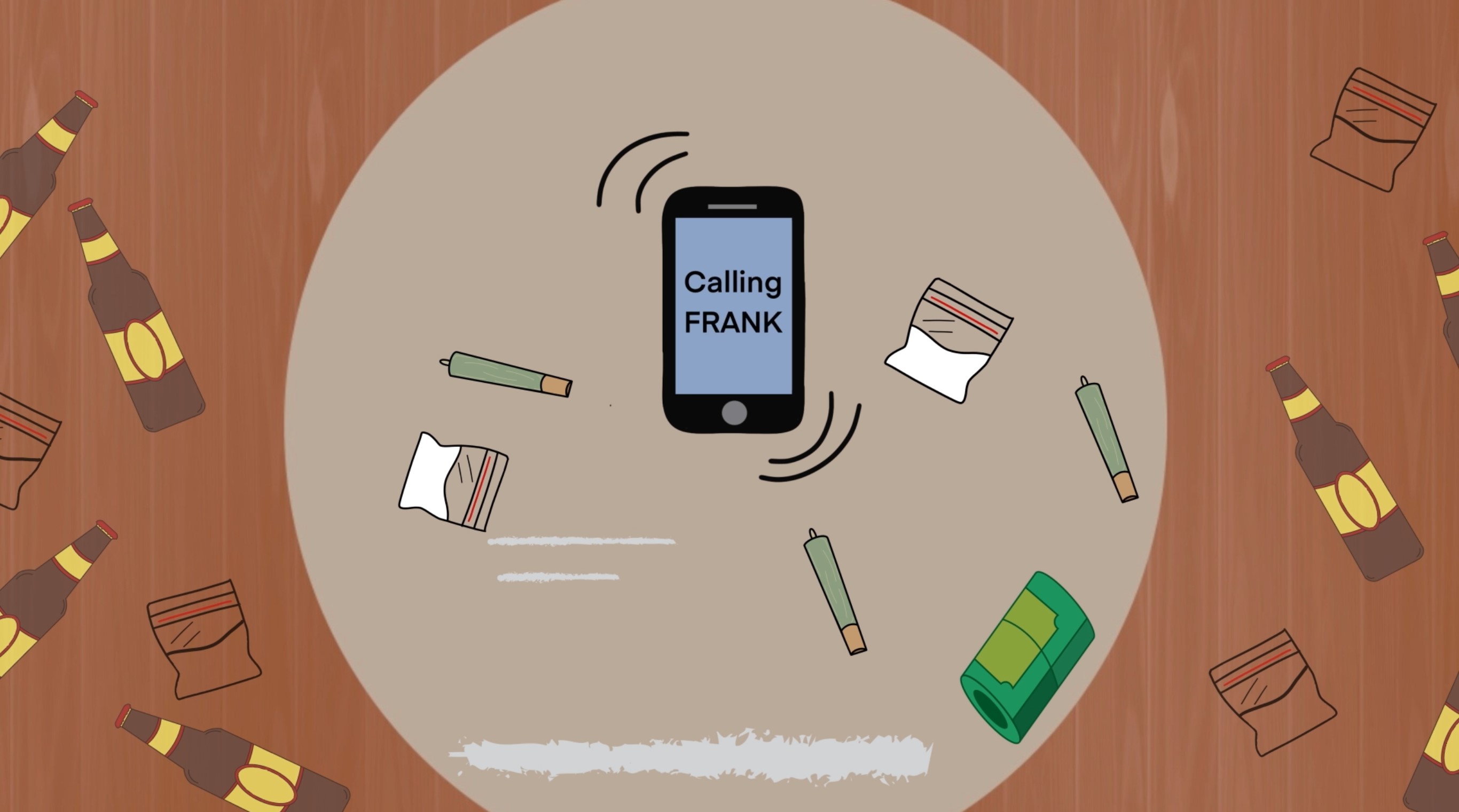
I began by experimenting with scene transformations using effects, which allowed me to practice techniques I could carry forward into the final animation. After receiving feedback, I made changes, such as revising the football scene to show the goalkeeper getting back up, making it clearer that they are enjoying the game and having fun. For the ringing Frank screen, my goal was to make the phone appear as if it’s ringing for help, with the pause representing Frank answering. However, after more feedback, I decided to shift focus toward emphasizing the phone ringing and continued the storyline by introducing more references to drugs.
In the tidying room scene, I wanted to show our main character becoming more active, symbolizing a healthier lifestyle and the act of cleaning their room. However, feedback highlighted that it wasn’t very clear they were tidying up. To improve this, I added a rubbish bag to indicate they’re on the right track. This also gave me the opportunity to incorporate more audio into the scene, drawing attention to the rubbish bag and enhancing the overall storytelling.
My input
As the leader of this project, my primary role was to manage the distribution of tasks and ensure that the workload was balanced across the team. I personally worked on creating 7 seconds of the final animation, which are shown above. While I’m proud of how they turned out, looking back, I would have made each of my clips longer, as the final animation could have benefited from more extended scenes.
My main contribution to this project was in organizing the animation and shaping its content. I took the lead in identifying our target audience, determining where the animation would be shown, and choosing the charity it would support. I also researched relevant statistics to incorporate into the animation, ensuring they resonated with our target audience, and carefully selected the most impactful ones to move forward with.
To begin the creative process, I wrote out the storyboards, detailing what would happen in each scene. Max then brought them to life with his incredible drawing skills. As we refined the storyboard, I made sure each scene's visual direction was planned and well-organized. I also wrote the audio script, considering time frames, and recorded the voiceover based on our chosen text. While I originally planned to use my own voice, we decided, after some feedback, that a classmate’s deeper voice would be a better fit for the role.
I also took inspiration from the "Dumb Ways to Die" campaign and worked on the initial character drawings. Alongside that, I created the "Good Friends" animation. My design role extended to crafting each scene and the objects within them, as seen above. Additionally, I created the party music using Strudel by coding it, which not only contributed to the project but also allowed me to learn a valuable new skill.
By evenly distributing the project, I discovered that we worked seamlessly together, each of us leveraging our unique strengths to focus on different aspects of the project. This collaborative approach allowed us to achieve the best possible outcome, combining our individual talents for a truly cohesive result.
Our test animation
This is the final animation we submitted for feedback. After reviewing it, the suggestion was to remove the "going back to the party" and "saying no" scenes. Initially, we used my voice for the narration, but based on feedback, we decided to switch to a deeper voice for a rougher, more impactful tone. Additionally, I revised the script to be in the first-person perspective, making it feel like the audio was directly from the speaker’s point of view. This change was meant to create a more relatable and immersive experience for the audience, connecting them with the journey on a personal level.
Reflection
Our animation for this project turned out to be visually compelling and has strong potential to reach a wider audience, especially if featured on FRANK’s website. As a team, we took a collaborative approach, with each member contributing equally to every stage of the animation process. My main role involved creating the animatics, designing the storyboards, drafting the audio script, and refining the timing of each frame to ensure smooth transitions and a cohesive flow. Additionally, I worked on producing the music and designing key scenes for the final animatic, which allowed for a seamless integration of everyone’s input, ensuring that each scene felt aligned with our collective vision.
Throughout the process, we worked together to maintain visual consistency, making sure that each character and scene complemented one another. This attention to detail ensured that the animation felt unified, both in terms of design and message. If we had more time, I would have loved to further develop the calming music and refine my skills in After Effects to improve character movement and overall fluidity in the later scenes. I also wanted to experiment with more dynamic camera techniques to enhance specific moments, creating a stronger emphasis and allowing for a more immersive experience for the audience.
To appeal to our target audience, we intentionally kept the aesthetic simple and approachable, drawing inspiration from the playful yet engaging style of Dumb Ways to Die. This design choice helped us craft an animation that was not only engaging and humorous but also relatable and memorable, reinforcing the playful yet impactful message we set out to convey.