Website making
Coding my website
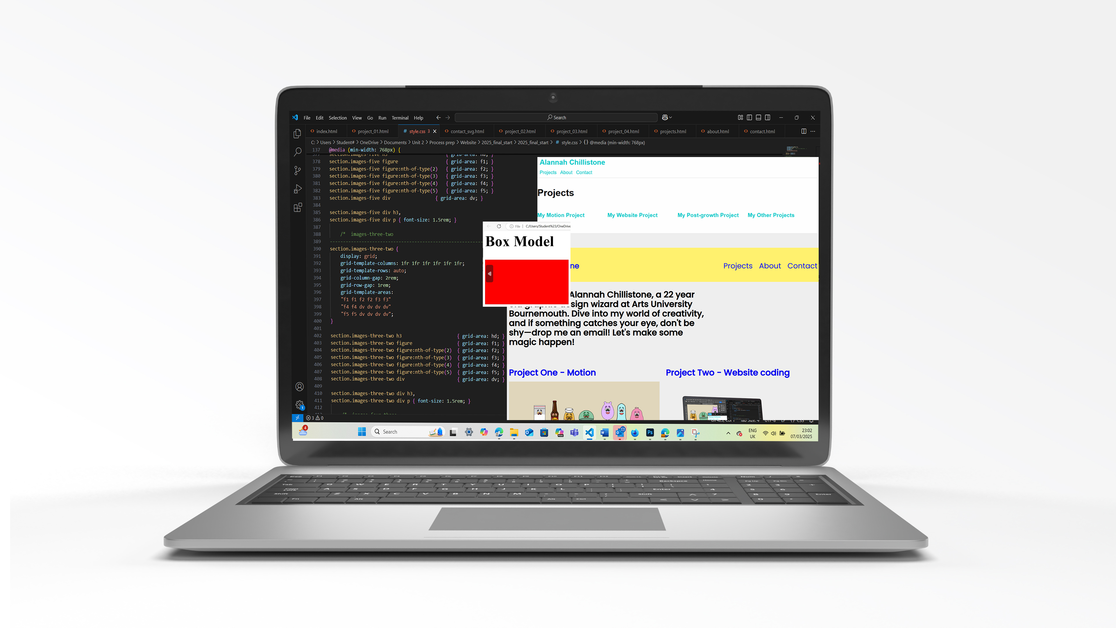
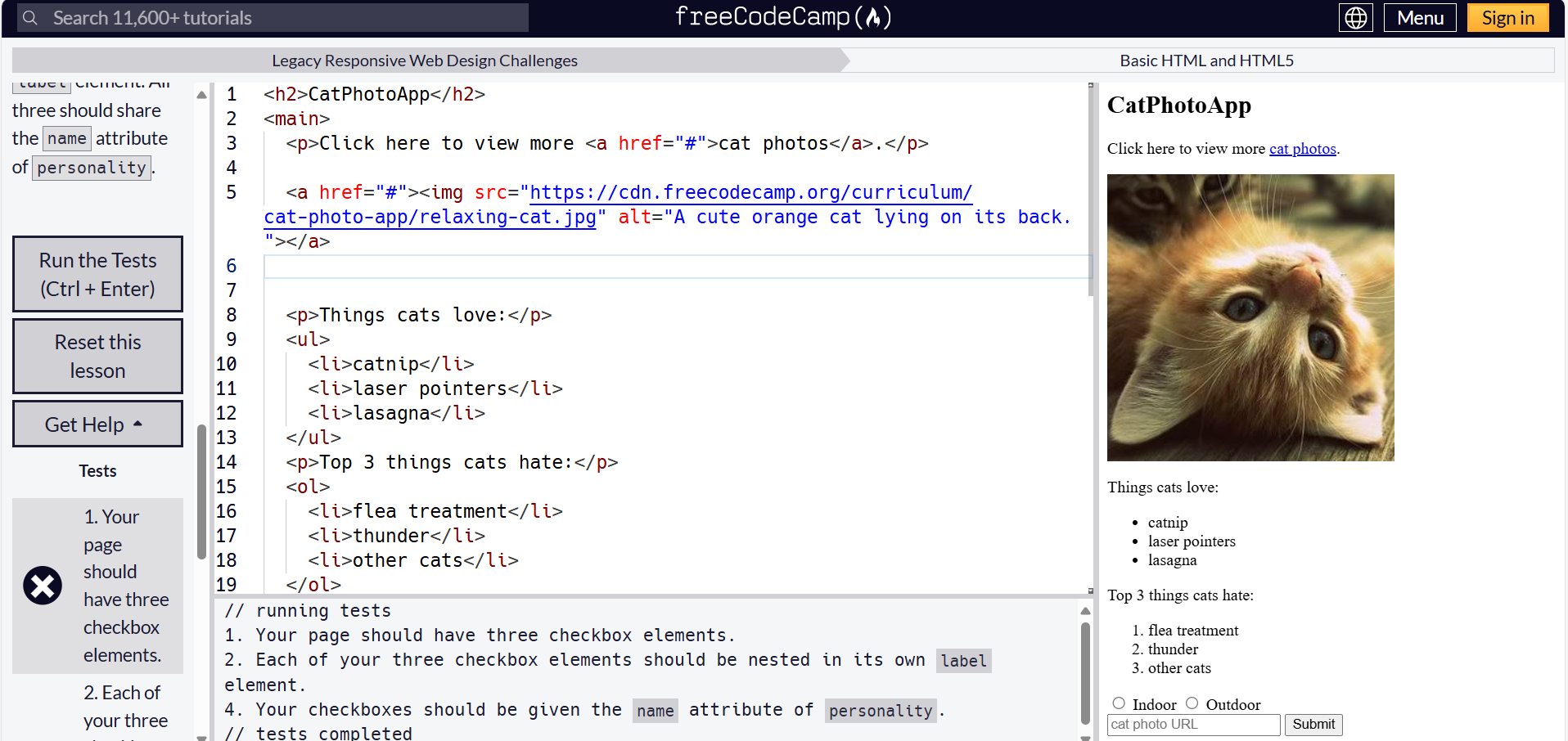
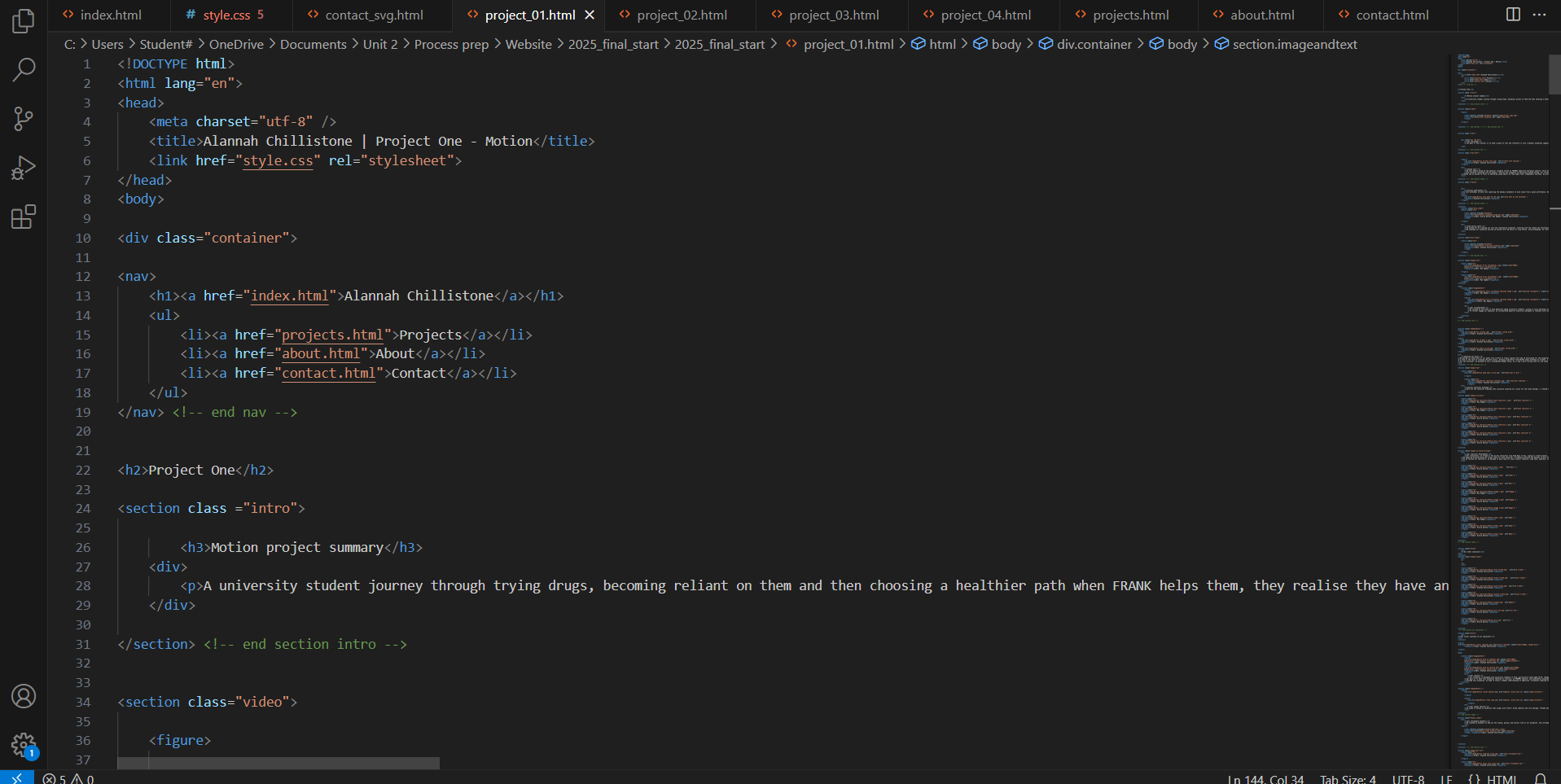
I’m diving headfirst into the world of coding, building my website from the ground up! Each line of code brings a new challenge, and I’m thrilled to watch my skills evolve as I craft something entirely my own. With HTML and CSS in Visual Studio Code, I’m building a polished, professional portfolio that reflects my growth and creativity. It’s exciting to see my vision come to life with every click!
The challenge
To design and build a dynamic online identity that showcases my creative portfolio, using HTML and CSS through Visual Studio Code. Along the way, I’ll be expanding my skills by learning the ins and outs of HTML and CSS through workshops and refining my knowledge with resources like Free Code Camp. My goal is to create a website that truly reflects who I am, both as a designer and as an individual. I’ll also be applying my understanding of wireframes, content strategy, typography, and colour theory to develop a site that is not only functional but visually engaging.
Wireframe and content
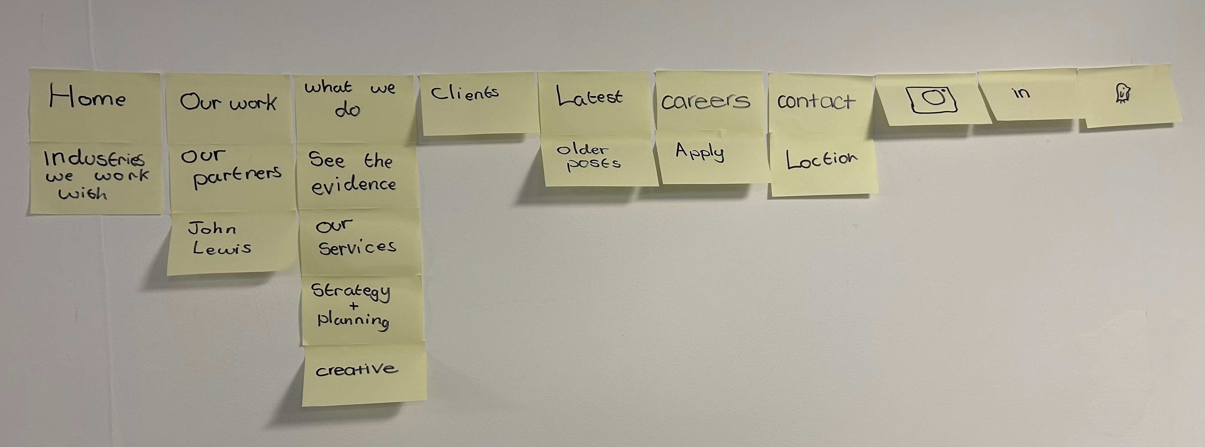
This workshop was an eye-opening experience, as it allowed us to analyse successful websites, focusing on their navigation, structure, and overall functionality. We started by creating a basic wireframe, which helped us visualize content layout and understand the key elements that make a website work well. By studying these websites, I learned how intuitive navigation, clear content hierarchy, and organization contribute to a smooth user experience.
I was able to incorporate aspects of these successful websites into my own project, particularly to improve my site’s structure and navigation. The workshop also highlighted what works and what doesn’t in web design. We discussed common issues like complex navigation or cluttered layouts, which gave me a better understanding of how to avoid such pitfalls.
Ultimately, this workshop gave me the practical tools to design a functional website, emphasizing the importance of user experience. The insights I gained have influenced my approach to web design, helping me create a more efficient and user-friendly site.
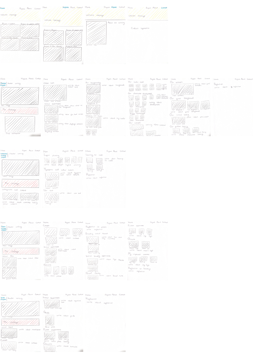
Layout planning
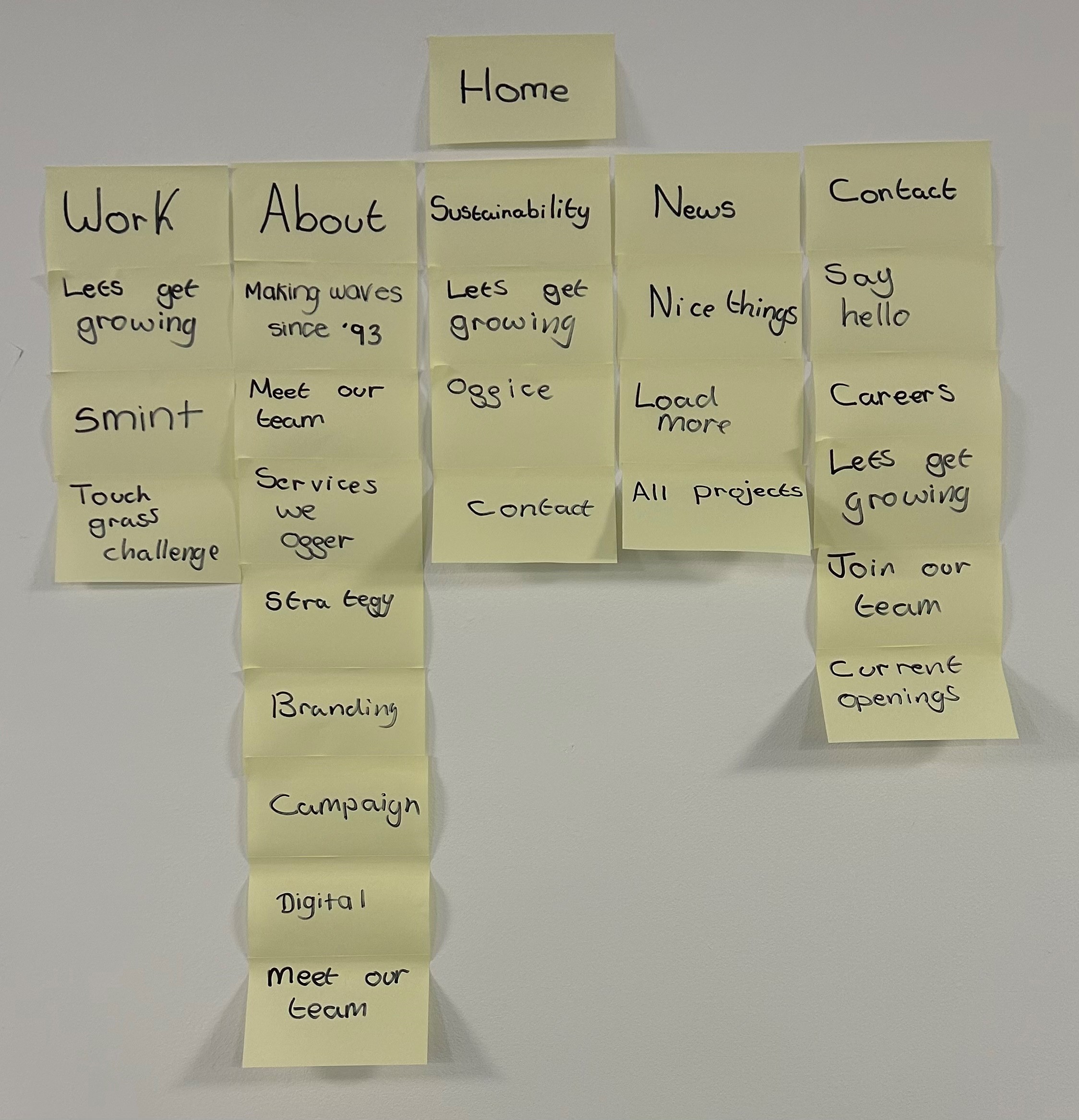
The insights I gained from the wireframe and content workshop were invaluable in shaping the initial layout of my website. By studying professional websites, I learned what content is essential to make my site look polished and functional.
This process also guided me in identifying the right codes to apply various effects, allowing me to refine my understanding of coding. As I worked through the project, I knew exactly what questions to ask during my workshop sessions to deepen my knowledge. The layout I created served as a blueprint, keeping me organized and on track throughout the project. It made it easier to visualize where each image, subtitle, and element should be placed, streamlining my workflow and ensuring a cohesive final design.
Typeface and colour scheme
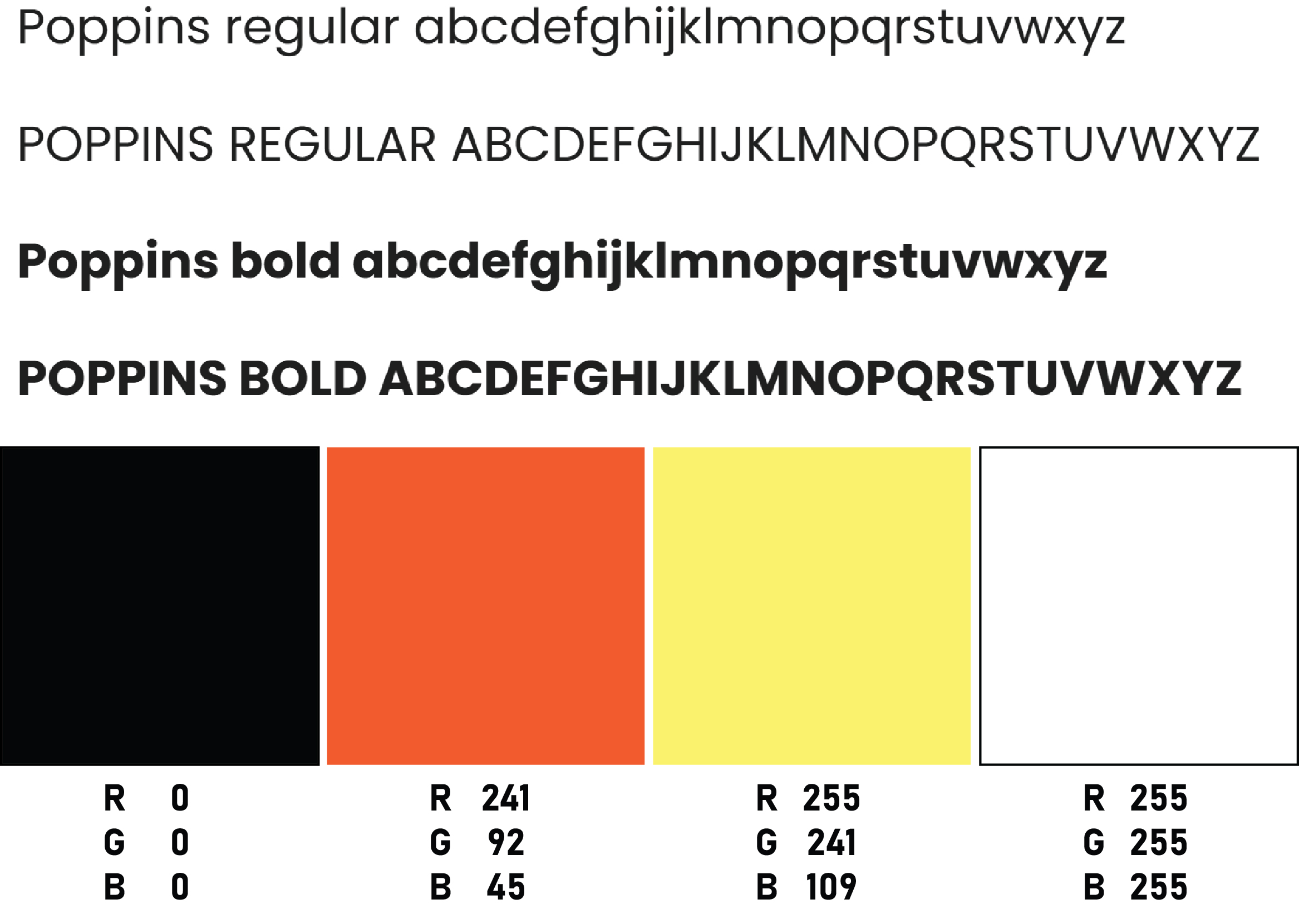
I chose to use Poppins Regular and Poppins Bold for my website's typeface because it’s my favourite font due to its clarity and readability, while still maintaining a professional aesthetic. This font is a popular web font, which means it will be accessible to all users visiting my site, ensuring consistency across devices.
For my colour scheme, I selected four colours that work harmoniously together. The red complements the yellow, creating a dynamic contrast, while black and white serve as versatile anchors that go with everything. I’ll be using yellow in the introductory sections of the page to grab attention, while the red will highlight my project challenges, making them stand out clearly for users. I opted for a white background because it allows the vibrant colours of my projects to shine without clashing with other hues. For the headlines, I chose black to provide strong contrast against the text, making them easy for users to spot.
I intentionally kept the colour palette minimal to ensure that the focus remains on my work. I wanted the design to be clean and simple, allowing the content to take centre stage without overwhelming the user.
User test
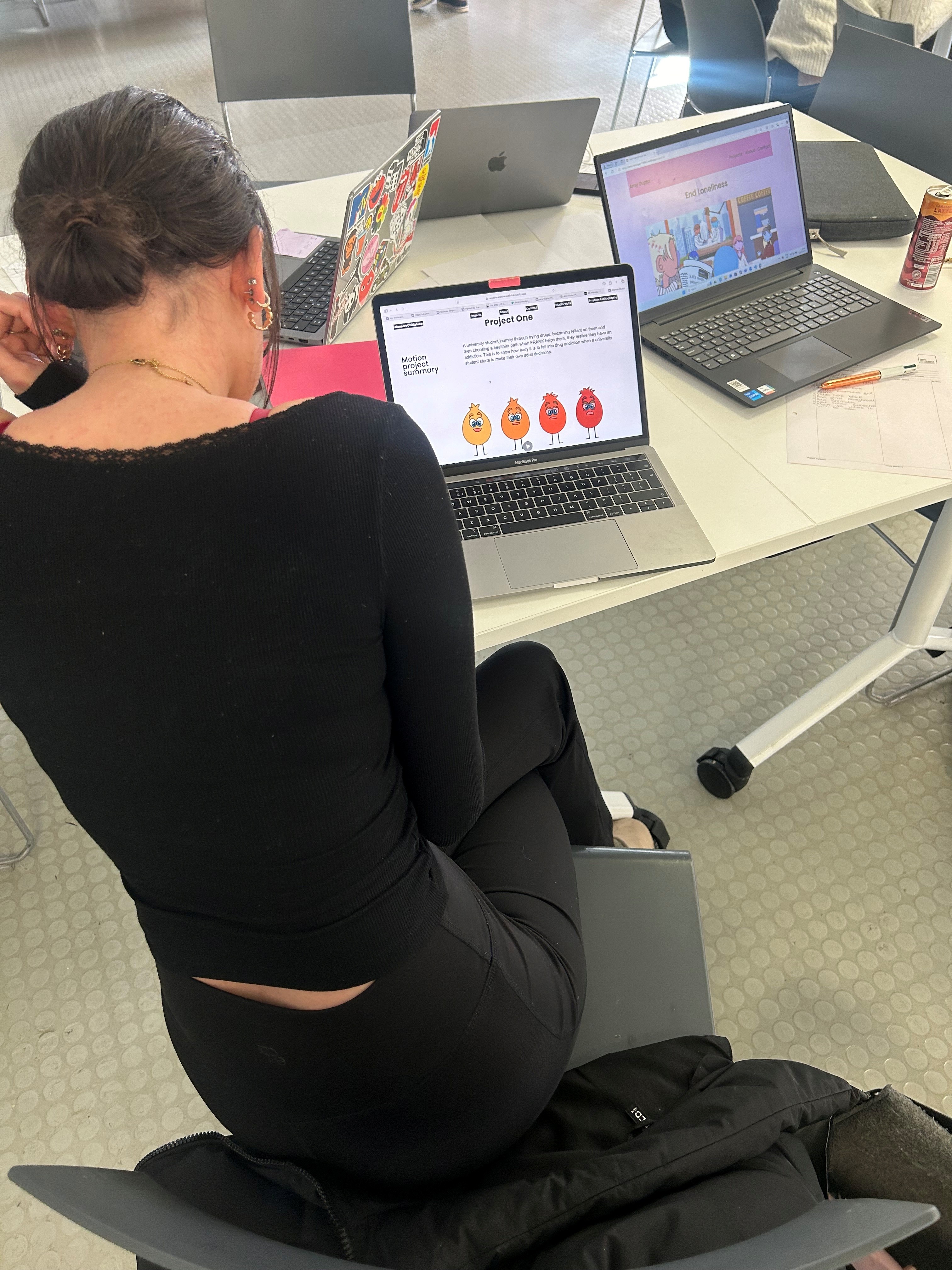
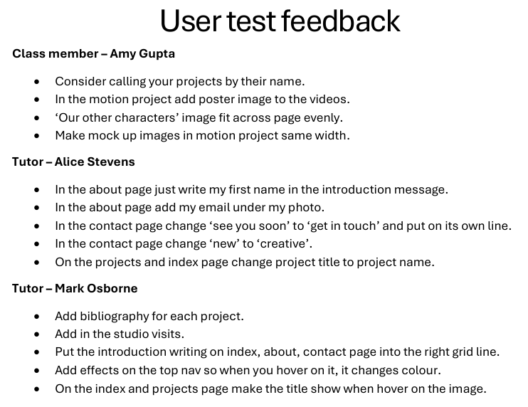
To ensure my website was functioning properly, I uploaded it to Netlify. Once it was live, I asked my classmate, Amy Gupta, to check it out on her computer and give me feedback on both its functionality and ease of navigation. In exchange, we swapped websites, and I had the chance to explore hers. It was fascinating to see the different design approaches, and it gave me a new perspective on my own work.
Amy provided some useful suggestions to improve my project. She pointed out a few simple tweaks that could enhance the overall user experience, making the website even more successful. She also praised the navigation, mentioning how easy it was for her to move through the site and how clear the content of each project was. The use of subtitles, she said, made it easy to identify what each project was about.
After receiving Amy’s feedback, I reached out to my tutor, Alice Stevens, for her insights. Alice suggested some quick fixes, like adjusting the typography. Her feedback also reinforced that my website was easy to navigate and that the content was clear. Alice had previously advised me to include a header and a summary for each project. This addition would allow visitors to understand the essence of each project without needing to read through the entire process.
Next, I approached my primary tutor for coding, Mark Osborne, to get his thoughts on how to improve the site further. Mark’s feedback was both practical and inspiring. He suggested ways to make the site more engaging, helping me incorporate additional interactive effects. With his guidance, I learned some new coding techniques that gave my website more life and personality, showcasing my skills as a designer.
All in all, the feedback I received was overwhelmingly positive, with only a few minor adjustments needed. These improvements helped fine-tune my website and made it more dynamic and user-friendly.
Learning to code
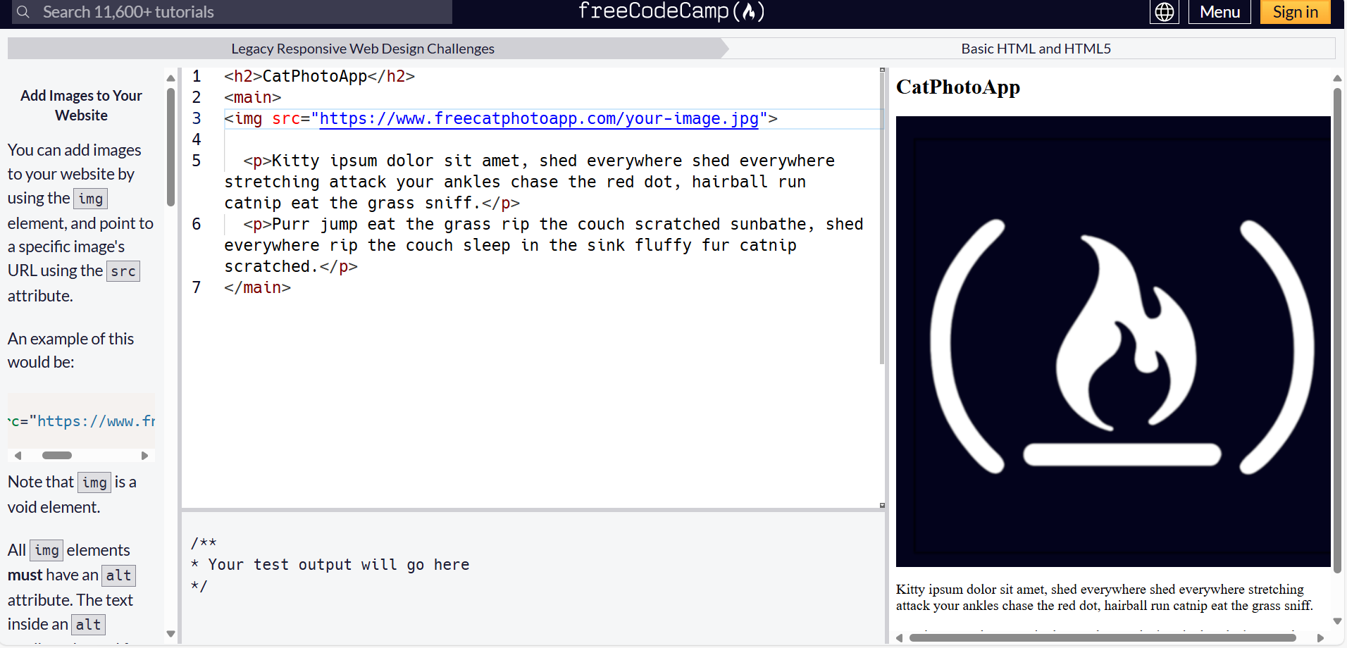
During Christmas break, I decided to dive into the world of coding, starting with notes and exploring the basics to get a solid grasp of it. I then jumped into hands-on workshops, where I practiced HTML, CSS grids, and got familiar with visual studio. The experience made me realize that the heart of my website is making navigation intuitive and seamless, ensuring that visitors can find what they need without any hassle. It’s all about clarity and user-friendly design.
Workshop lessons
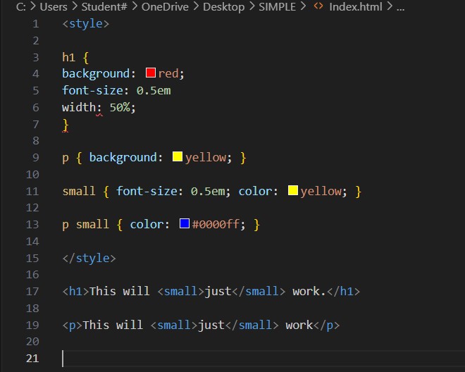
I made sure to attend every available workshop to deepen my understanding of coding, as this was my first time using it. Mark’s workshops were incredibly helpful in teaching me the fundamentals. I quickly realized that the most important aspect of coding is ensuring the CSS style sheet is set up properly, as it controls how my text and images are arranged on the page. At first, understanding what each line of code meant was challenging, but once the concepts clicked, everything started to come together.
Given that this was a relatively short project, I feel I’ve picked up CSS coding quickly. I’m proud of how far I’ve come in such a short time, but I’m eager to continue learning. In the future, I’d love to develop my website further to make it even more dynamic and engaging, adding new features and effects to make the user experience even more exciting.
Reflection
Overall, I believe my website successfully represents both me as a designer and as an individual. It serves as a professional portfolio that I would be proud to share with potential employers or clients as I continue my career journey. The process of planning my wireframe and content was key in helping me manage my time effectively and stay focused on the skills I needed to improve. I’m confident that my website’s structure is user-friendly and intuitive, making navigation simple and straightforward.
When I pulled all the elements together, I was pleased with how professional the website looked. A lot of this success came from thorough pre-planning—deciding how the website would look, what content to include, selecting images, and organizing the layout of each page. This careful planning made the design process much smoother and helped create a cohesive result.
This project marked my first experience with coding, and initially, I was nervous because it seemed so complex. However, I soon realized that the key to coding is understanding grids. Once the grid structure is in place, everything else—designs and text—falls into place more easily. Attending every available workshop played a crucial role in helping me understand coding and the functionality of my website. Once I grasped the fundamentals, I started experimenting with effects to make the site more engaging and dynamic.
If I had more time, I would work on organizing my CSS style sheet to make it easier to navigate and find specific elements. Additionally, I would love to create a dedicated page to showcase my studio visits, allowing users to see the places that have influenced me and sparked my interest. I’d also include a separate page for my personal work to give it the attention it deserves and provide users with a deeper understanding of my design approach and creative process.