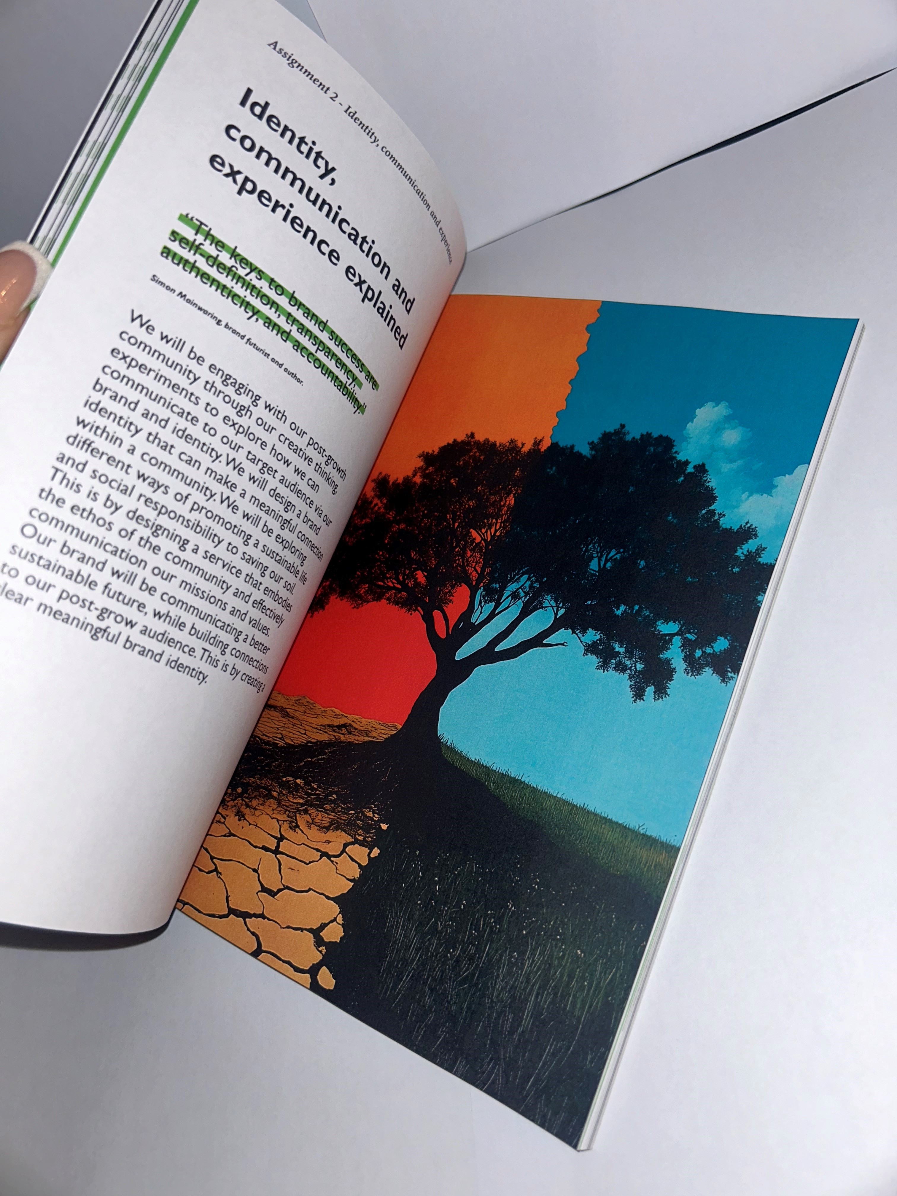
Post growth
Promoting a future with Soil-ID
Imagine a world where we move away from NPK fertilizers and reconnect with the earth. Through hands-on activities, we'd help grow organic food, support local farmers, and educate on the health benefits of connecting with nature.
The challenge
Imagine a world where we ditch NPK fertilizers and reconnect with the earth. We’d invite our local community to roll up their sleeves and give back to the soil through fun, hands-on activities. Together, we’d grow and harvest organic food or lend a hand to farmers cultivating theirs. Not only would this make healthy, fresh produce more affordable, but it would also offer a chance to reconnect with nature. Plus, we’d educate everyone on the amazing health benefits of getting our hands dirty—because sometimes, the best way to heal is to touch the earth itself.
Initial ideas
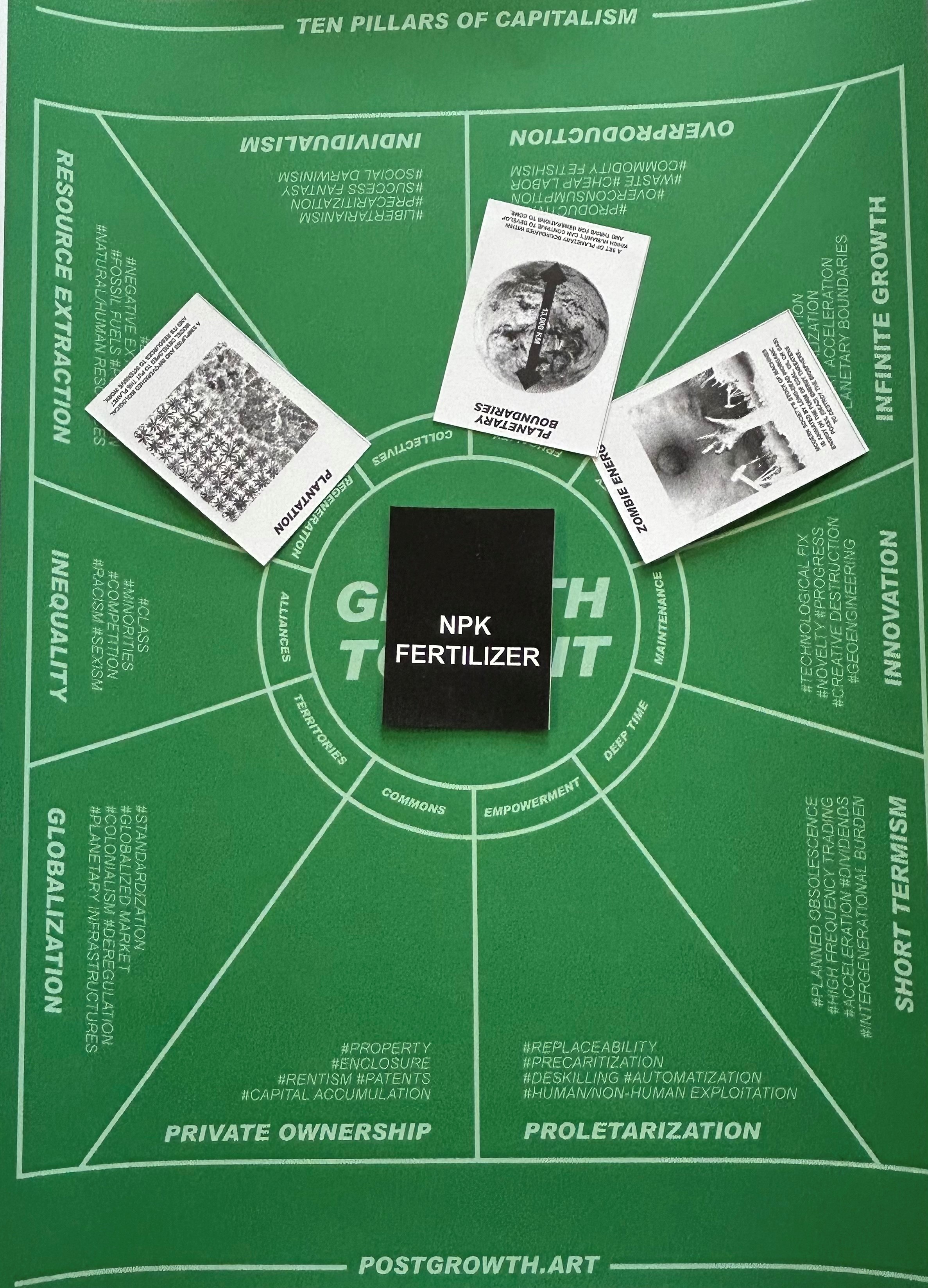
Our post-growth toolkit included intriguing cards like Zombie Energy, Planetary Boundaries, and Plantation—sparking our first wave of ideas and helping us explore different possibilities. At first, we were stumped on how to replace NPK fertilizers with something more natural, but this toolkit pushed us to think outside the box and explore alternative methods.
We began by investigating ways to eliminate fossil fuels and sought out natural, sustainable resources like compost, manure, and electrolysis. We also investigated greener alternatives to petrol-powered vehicles, considering solar-powered options, human and animal labour. Feedback from our presentations steered us to focus on soil pollution and how it affects sustainability. This led us to explore innovative solutions like sprinklers and soil sensors to track and reduce water pollution.
We’re diving into some exciting ideas that could make a real impact: soil celebration events, vegetable boxes, soil trackers, crop rotation, and even a recipe book! These are our top picks, and we’re ready to develop them further to see which ones can truly thrive. Our goal? To minimize fossil fuel use and maximize our positive impact on the environment. We’re all about creating sustainable solutions that not only nourish the earth but also inspire real change.
Context
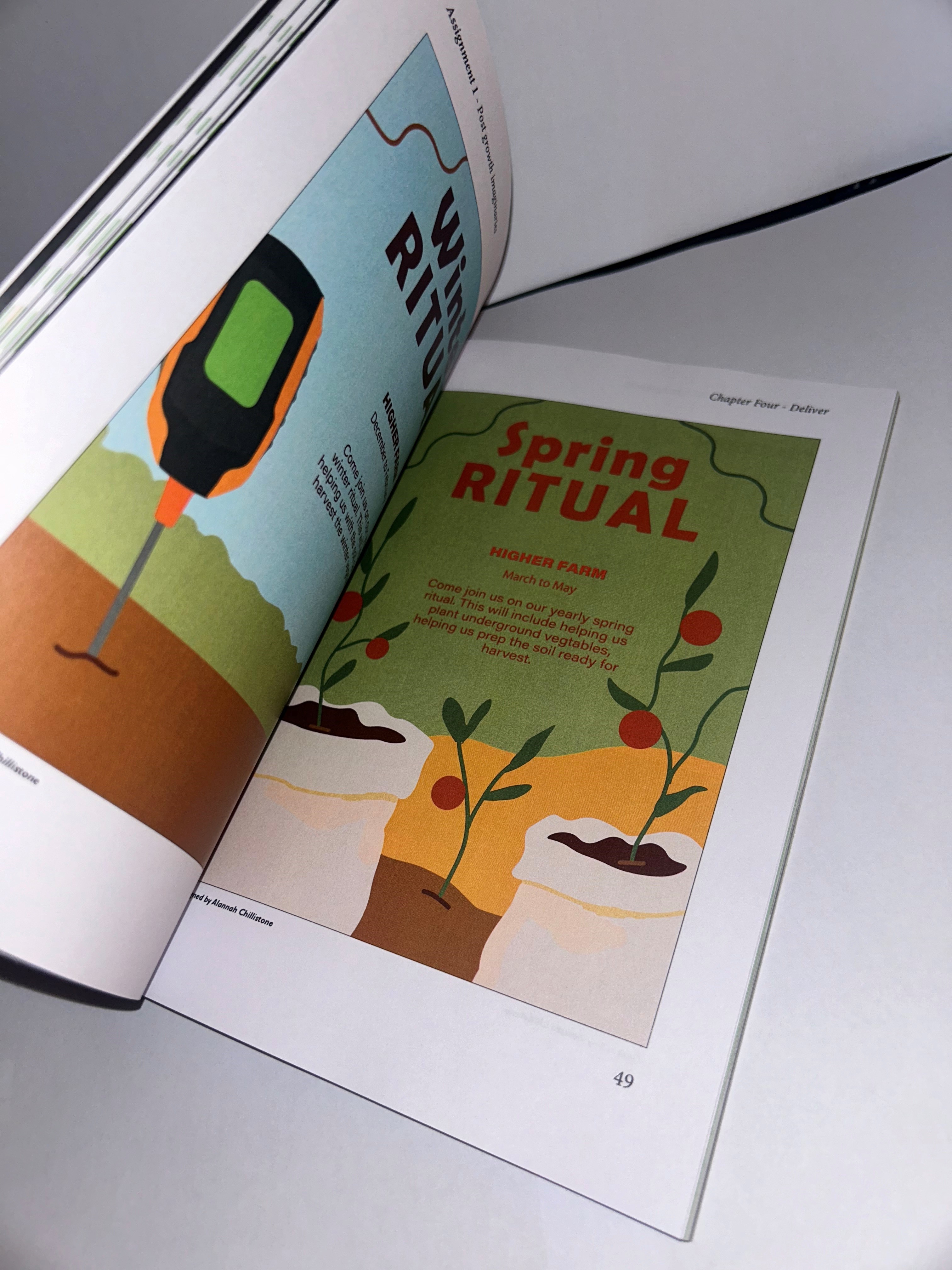
We’re seeking adventurous families eager to embrace new experiences! Our activities offer a peaceful, ethical escape from daily stress, providing a safe outdoor environment for everyone. For kids aged 4-14, we have fun hands-on activities like soil sculptures, planting, and picking local produce, all while teaching them the importance of healthy soil and eating vegetables. Adults can join in too! Enjoy live music, a food truck, and farm shop while learning how organic food and healthy soil can transform your life. We're looking for open-minded, outdoorsy families ready to explore and make lasting memories.
Our posters will be displayed throughout the local community, making sure everyone has a chance to see and connect with them. For the kids, we’ll place vibrant posters in schools and classrooms, sparking curiosity and bringing the message directly to their world.
Initial experiments
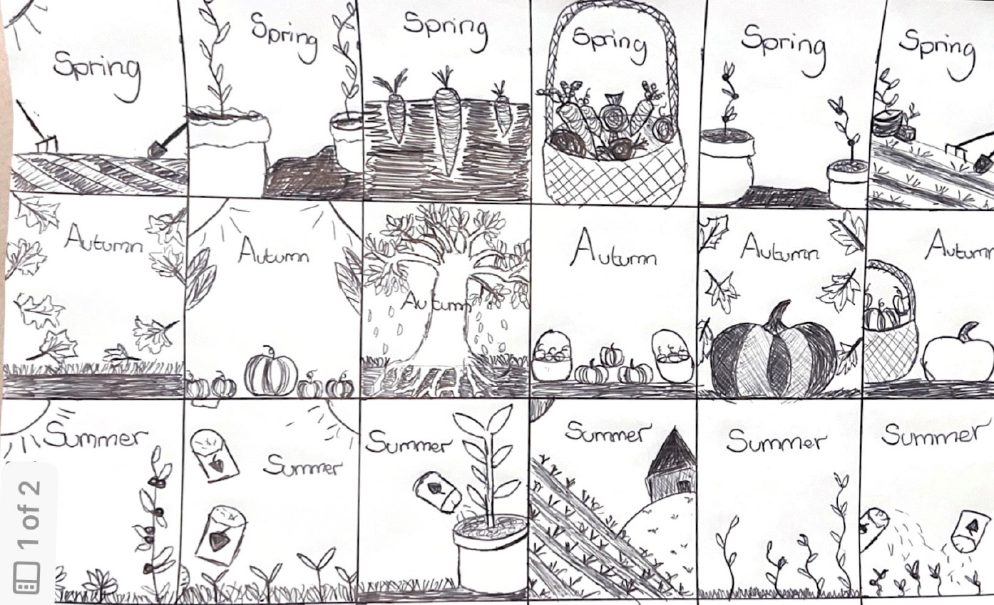
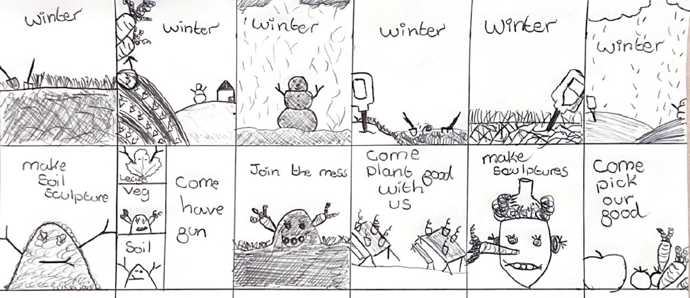
I began by sketching out my initial ideas for the posters, letting my creativity flow freely. These rough sketches were more than just doodles—they became the foundation that shaped the entire design process. As I refined each sketch, I experimented with colours, layouts, and imagery, allowing the ideas to evolve into something that truly captured the essence of our message. These early drafts helped spark inspiration and set the direction for the final posters, giving them the energy and vision needed to stand out and resonate with the audience.
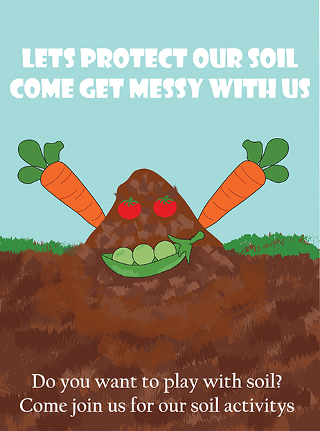
Outcome
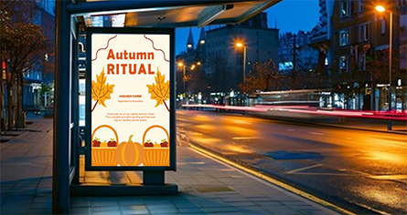
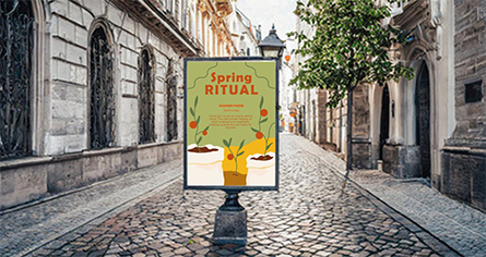
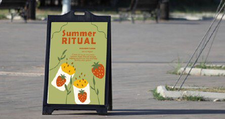
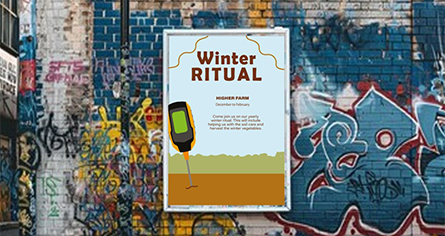
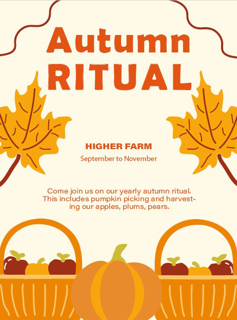
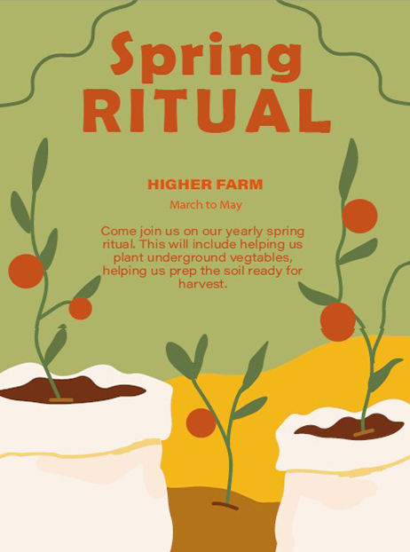
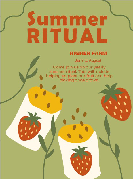
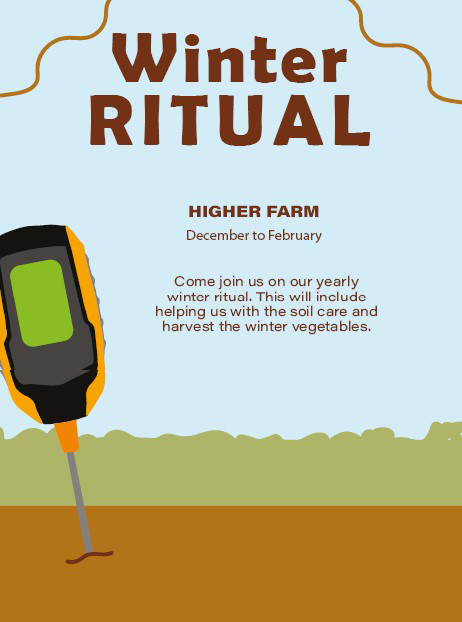
Here are the final versions of our event posters for each season, designed to be displayed throughout the local community as invitations. While I’m happy with most of the designs, I must admit that the winter poster is my least favourite. If I had more time, I would have loved to revisit it and ensure it blends seamlessly with the aesthetic of the other seasonal posters.
For the children’s poster, I created something specifically for their classrooms and schools. I wanted it to feel vibrant, playful, and engaging—something that would capture their attention and spark excitement.
However, my favourite by far is the spring poster. I’m proud of how it turned out. The design feels fresh and lively, perfectly reflecting the energy and beauty of the season. It’s the one I feel most connected to, and I think it truly captures the essence of spring.
Reflection on our posters
At the start, I was unsure about our topic of NPK fertilizer, feeling limited in ideas. Initially, I wasn’t excited about it and even considered swapping topics. However, after doing more research and participating in an ideation workshop, I became more comfortable exploring different possibilities. While I believe our concept has potential for the post-growth future, it still requires further development.
Joining the team was a bit challenging, as I didn’t know anyone, but we quickly found our rhythm. Each of us brought different design skills to the table, and I enjoyed working with my teammates. However, I found myself taking on the leadership role, as some team members were disorganized, missing lectures, and struggling with time management. This made it difficult to maintain good teamwork, as it often fell on Toby Coombe and me to pick up the slack. Toby, on the other hand, consistently worked hard, communicated well, and had excellent time management skills.
Through this experience, I learned that I need to improve my presentation, organizational, and teamwork skills. I need to speak more confidently and at a slower pace when presenting, and I need to be better at delegating tasks and ensuring everyone contributes. I also enjoyed designing event posters for Assignment 1 and diving into research about NPK fertilizers, discovering how complex the subject was. The workshops on InDesign, Illustrator, and Blender were particularly helpful, as it had been a while since I used those tools, and they boosted my confidence. Lastly, I’ve grown better at accepting critical feedback and using it to improve my work, something I struggled with before.
Initial research - Branding
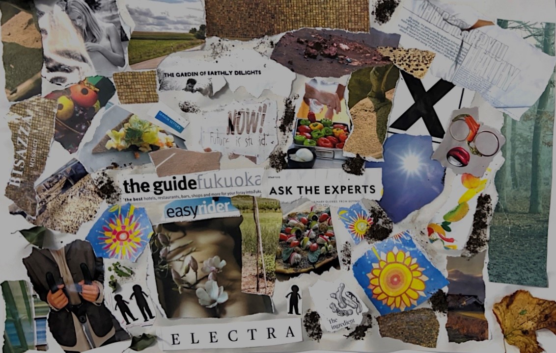
Our mood board became a creative spark, inspiring us with its colours, patterns, and typography. As a team, we shared our favourite elements from the board, each adding personal cutouts to highlight what inspired us and why. Nature was our primary focus, but we also explored unique patterns, like tiled walls, to represent soil.
This workshop was a turning point, helping us define our brand’s core values, characteristics, and purpose. We worked together to identify key words for each topic—why, how, and what—ultimately narrowing them down to our top four favourites. From there, we researched and refined our brand name, evolving it from our initial ideas. The workshop revealed the essential elements that truly define what we want our brand to stand for.
Initial experiments - Branding
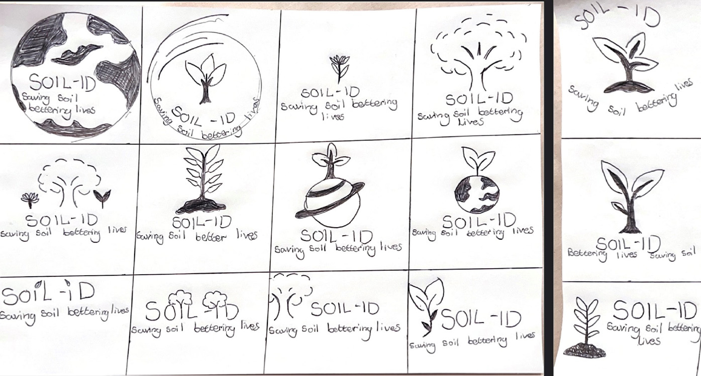
Natalie’s workshop on logo design was a game-changer in helping me develop my Illustrator skills. During the session, I created four logos (shown to the right), each inspired by designs I admired. By deconstructing these logos, I gained valuable insights into the design process, especially the importance of maintaining consistent line widths and improving my use of the curvature tool.
The logos I focused on all shared a minimalist approach, utilizing two main colours to keep the designs clean and easy to recognize—even when scaled down. What stood out to me was how each logo, despite its simplicity, communicated a clear brand identity and mission. Some logos included a tagline, but even without it, the image itself effectively conveyed the brand’s essence. This experience taught me a lot about creating memorable, impactful logos, and I’m eager to apply these lessons as we move forward in designing our own logo.
Brand identity
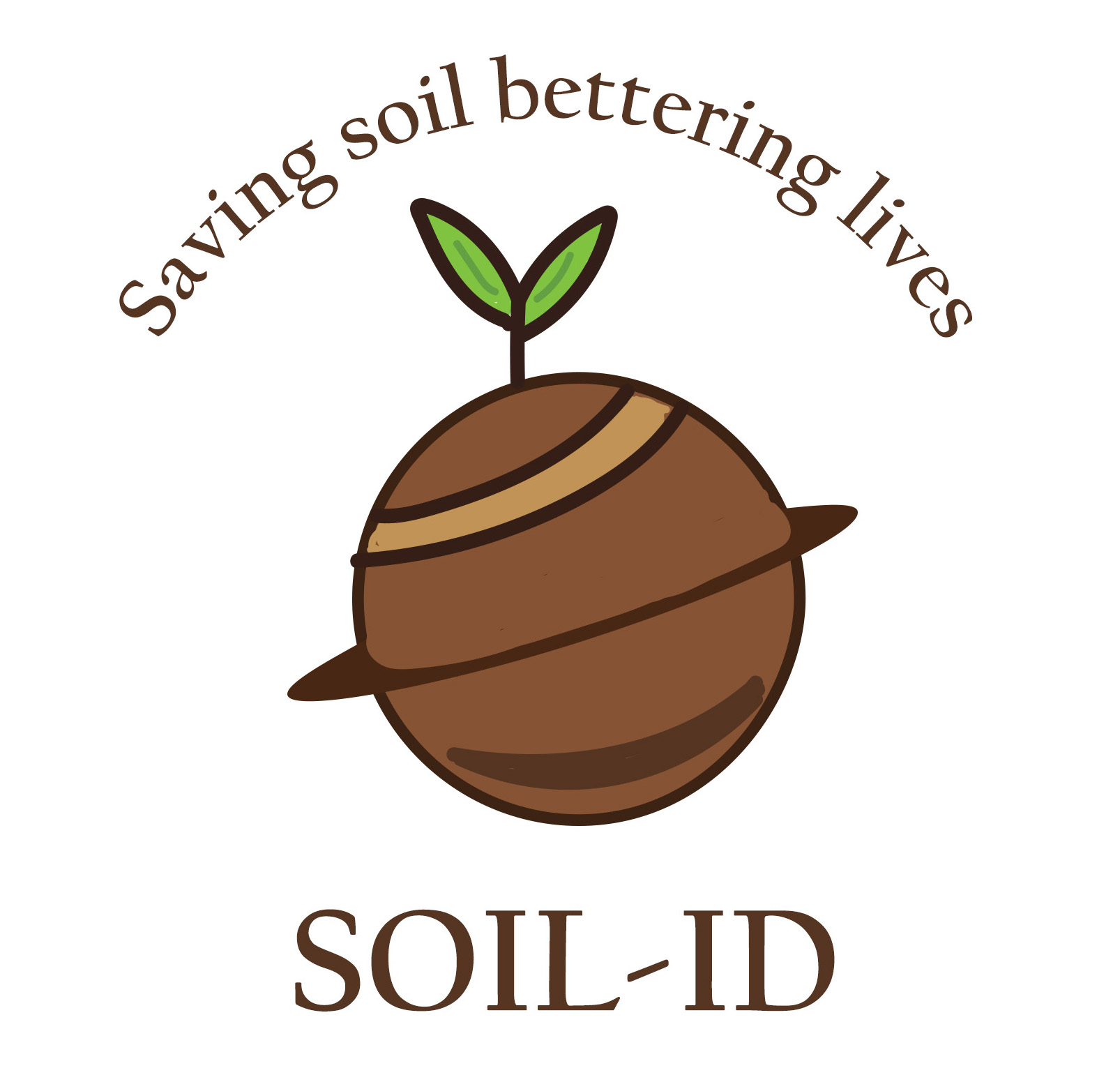
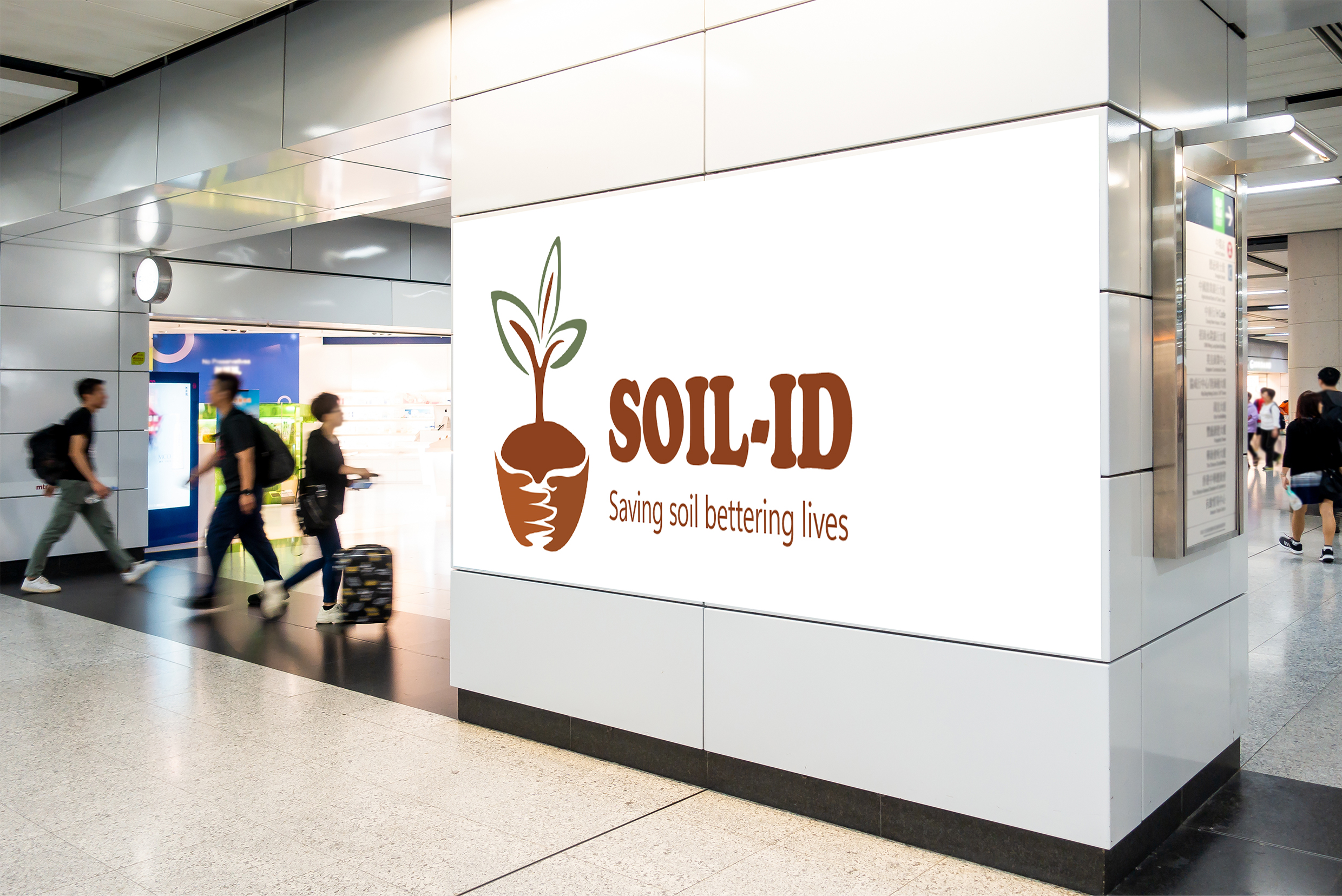
"Soil-id" is the perfect brand name for us—it’s a clever play on words, representing soil’s unique identity. Soil is the foundation of all ecosystems, and without it, everything would fall apart. That’s why it deserves to be recognized as an essential part of our world, not something separate or overlooked. The logo itself complements the name, echoing the word "solid," which reflects the solid particles that make up soil. This name resonated with us because it feels earthy, grounded, and organic—just like the rituals we’ve designed around nurturing and honouring the soil.
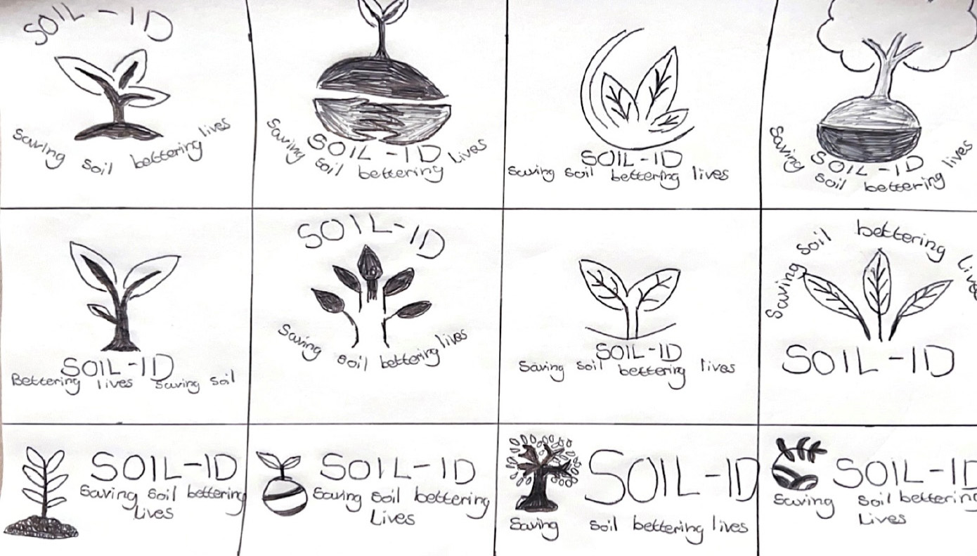
Further experiments - Branding
This logo happens to be my least favorite, and I think it’s because the shape isn’t perfectly circular due to the plant element. This slight misalignment caused the font to sit off-center, which doesn’t feel quite right. If I were to revisit this design, I’d pay much closer attention to the text placement to ensure a more balanced and harmonious look. While this logo has potential for improvement if I decide to revisit it, I do feel that the intricate details in the plant could make it harder to maintain visibility, especially at smaller sizes.
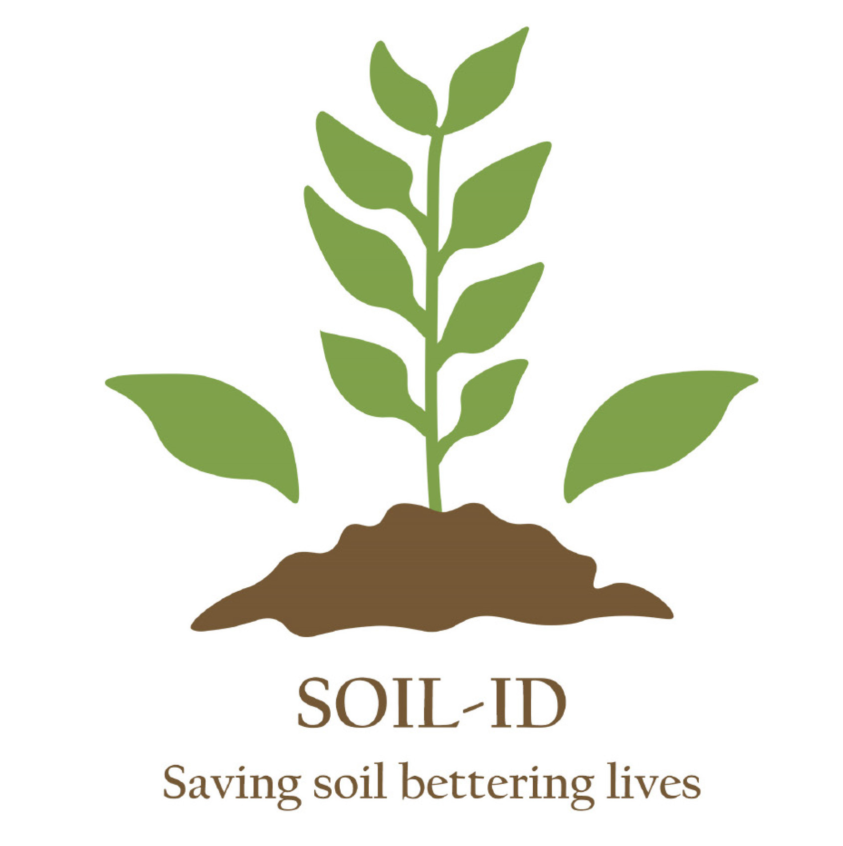
This is my second favorite logo design I've created. While it's simple, it’s incredibly effective in conveying the core mission and values of our brand. I really appreciate the clean, minimalist feel with just two colors, which adds to its clarity. If I had the chance to revisit it, I’d experiment with a more playful, bubble-style font for the brand name to give it a bit more personality. Overall, I believe this logo has great potential to evolve and be repurposed as an icon throughout our process.
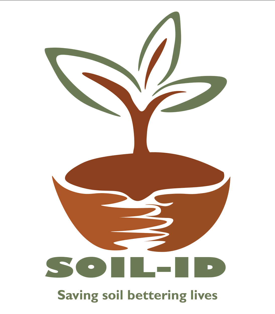
This logo is my favourite design because it beautifully symbolizes hands cradling the soil, with a tree growing and blossoming into vibrant flowers. It captures our brand's mission of protecting and nurturing the earth in a visual, impactful way. I believe this is my strongest logo as it clearly conveys our brand’s identity and purpose. However, due to its intricate details, it might not always be immediately clear at first glance. Despite that, I’m proud of how it tells our story visually, bringing our values to life.

Outcome
Our final logo is showcased above, with the black version being the one we’ll primarily use. However, we wanted to explore how the logo would look in different colours to see how it might evolve. We also took valuable feedback from Tom McQullin into account during the design process. Reflecting on the work, if we had the chance to revisit it, I’d make the text more visible and legible for better clarity. I’m also not entirely happy with how the hands turned out—they look a bit pixelated and lack the solid, clean finish that would make them stand out across different mock-ups. Despite this, I’m proud of how the logo conveys our mission and identity, and the feedback has only strengthened our vision for future designs.
My improved outcome
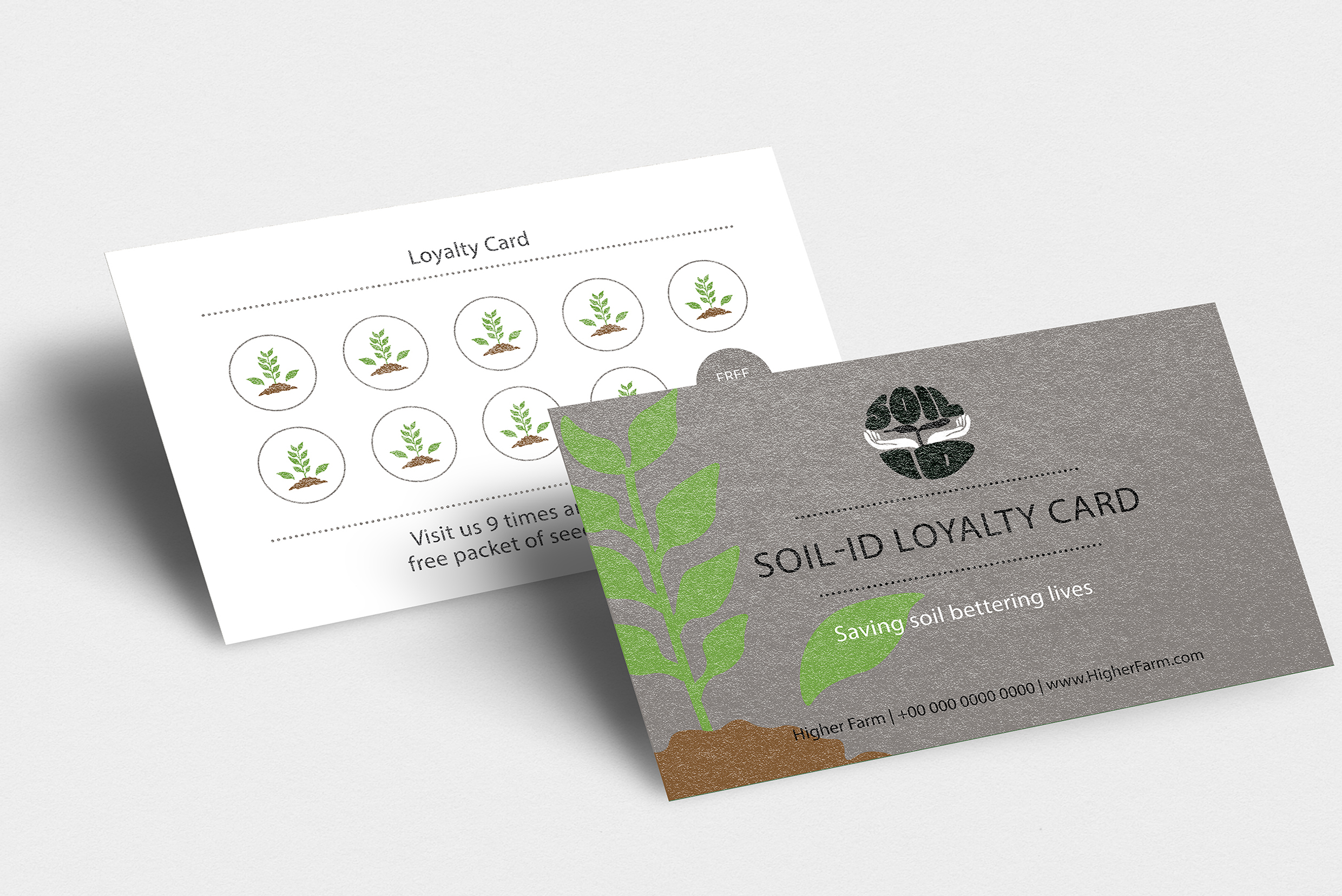
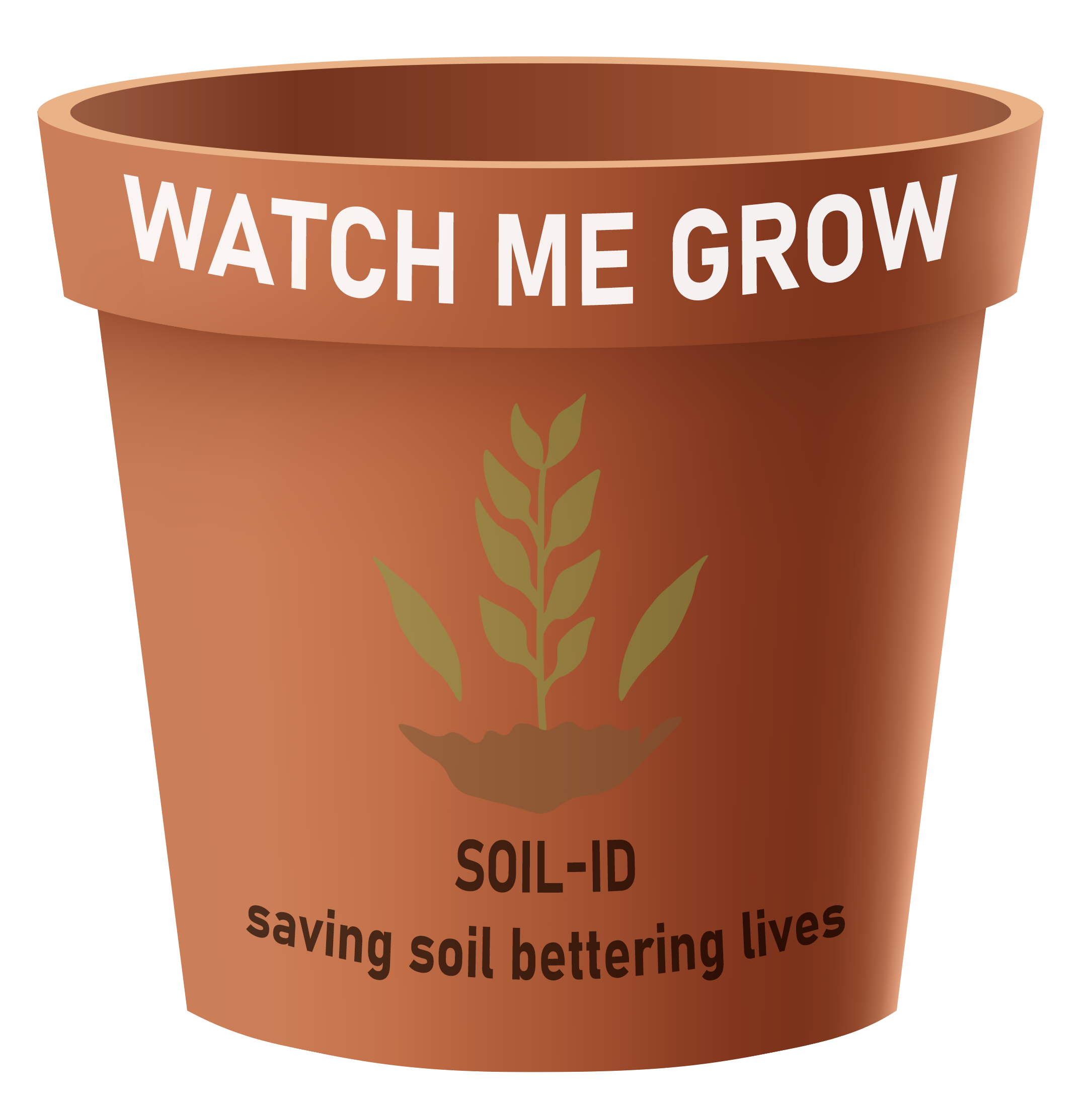
For this assignment, I was given an extra week to refine and expand my work. During this time, I focused on incorporating the feedback from Alice, as I hadn’t had enough time to address it earlier. I made several updates to my presentation, including adding the children’s poster from Assignment 1, designing a loyalty card, creating a flowerpot and seed packet, and developing a visual sign for the soil activity. I also took the opportunity to design additional mock-ups, which I’ve added to the process book to help carry the storyline forward.
Since I had the extra time, I worked independently to challenge myself and continue evolving my designs. I also redesigned a new logo (shown on the right) to improve on our original concept. All the additional elements I worked on were incorporated into our group presentations, ensuring they aligned with the overall narrative and strengthened the cohesion of our project.
Reflection on branding
In conclusion, I’m proud of our designs and the "post-grow" concept we developed for Assignment 2. Our idea is both realistic and impactful, offering a solution to help sustain our ecosystem. Since I had extra time, I took the initiative to further develop the project on my own, while the rest of the group submitted their parts. I also revisited the logo after receiving feedback from Alice following our London trip. If we’d had more time as a team, I would have loved to prototype the new brand experience, which I believe would have taken the project to the next level.
Throughout this process, I’ve learned that I need to improve my storytelling skills. I often struggle with organizing my thoughts and tend to repeat myself. I’m confident that with more practice, I’ll improve in this area over time. I also realized I need to step up as a better teammate. In this project, I found myself taking on a leadership role, writing most of the presentations, and picking up the slack for others. While Toby Coombe and I worked well together, I struggled with the work ethic and standards of some group members.
Although I found the critical evaluation challenging and lacked confidence in my work, I know that practice will help me improve. I particularly enjoyed the branding aspect of the project, researching logos, sketching ideas, and developing them into final designs. I also grew my skills in Illustrator and InDesign, especially when it came to creating professional page grids. Moving forward, I’m excited to continue improving my skills and learning throughout the year.
Printing my process book
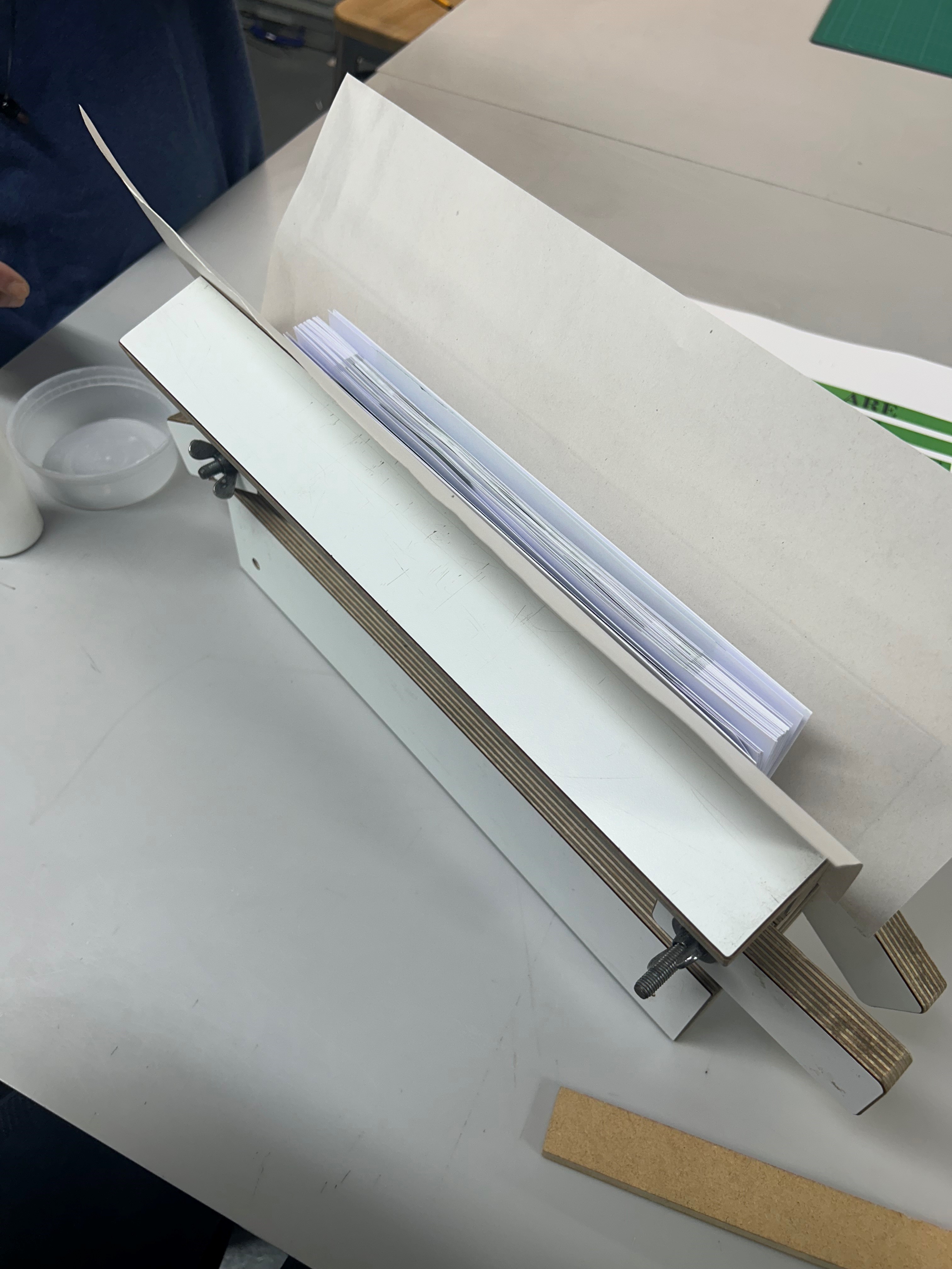
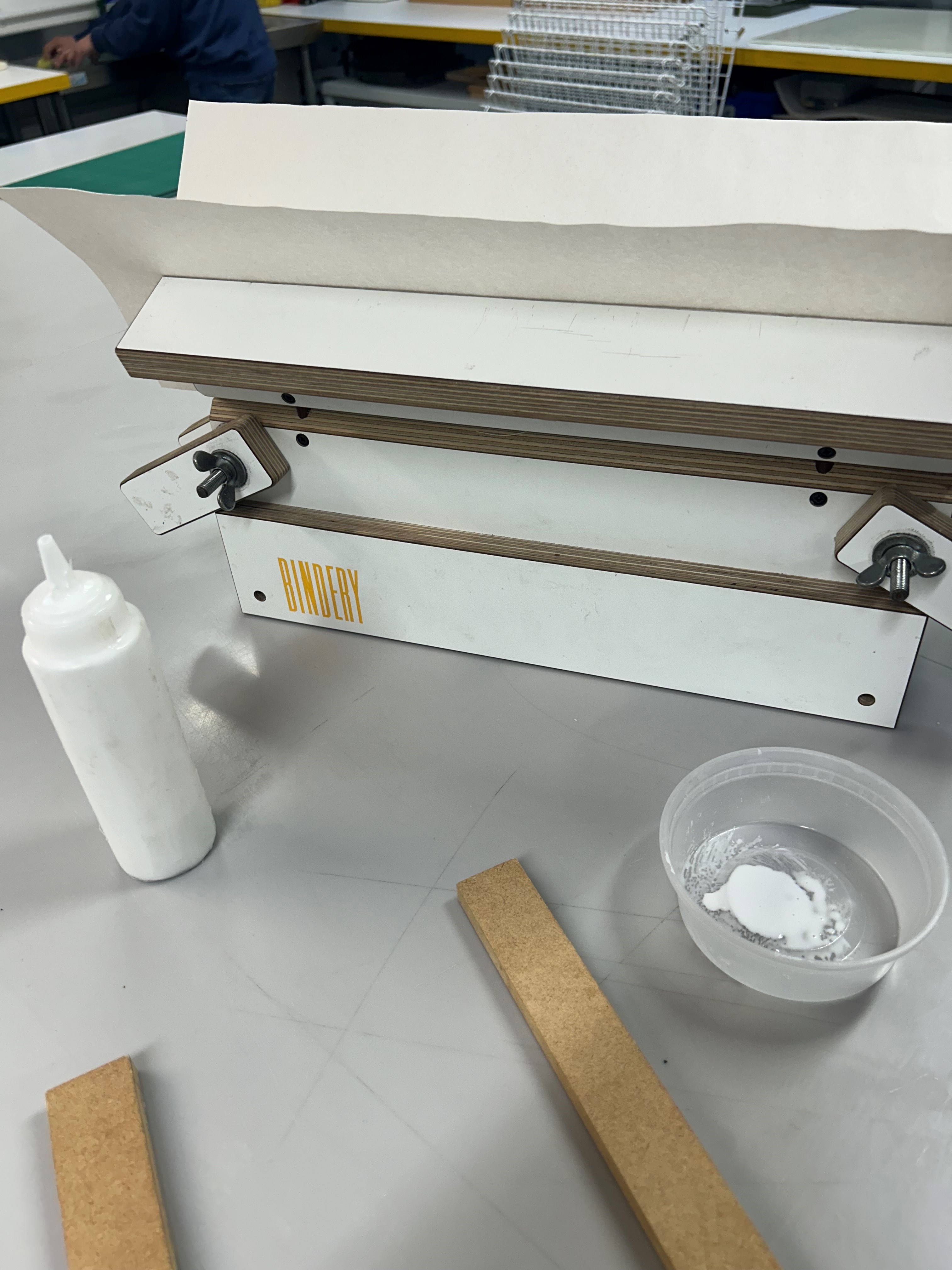
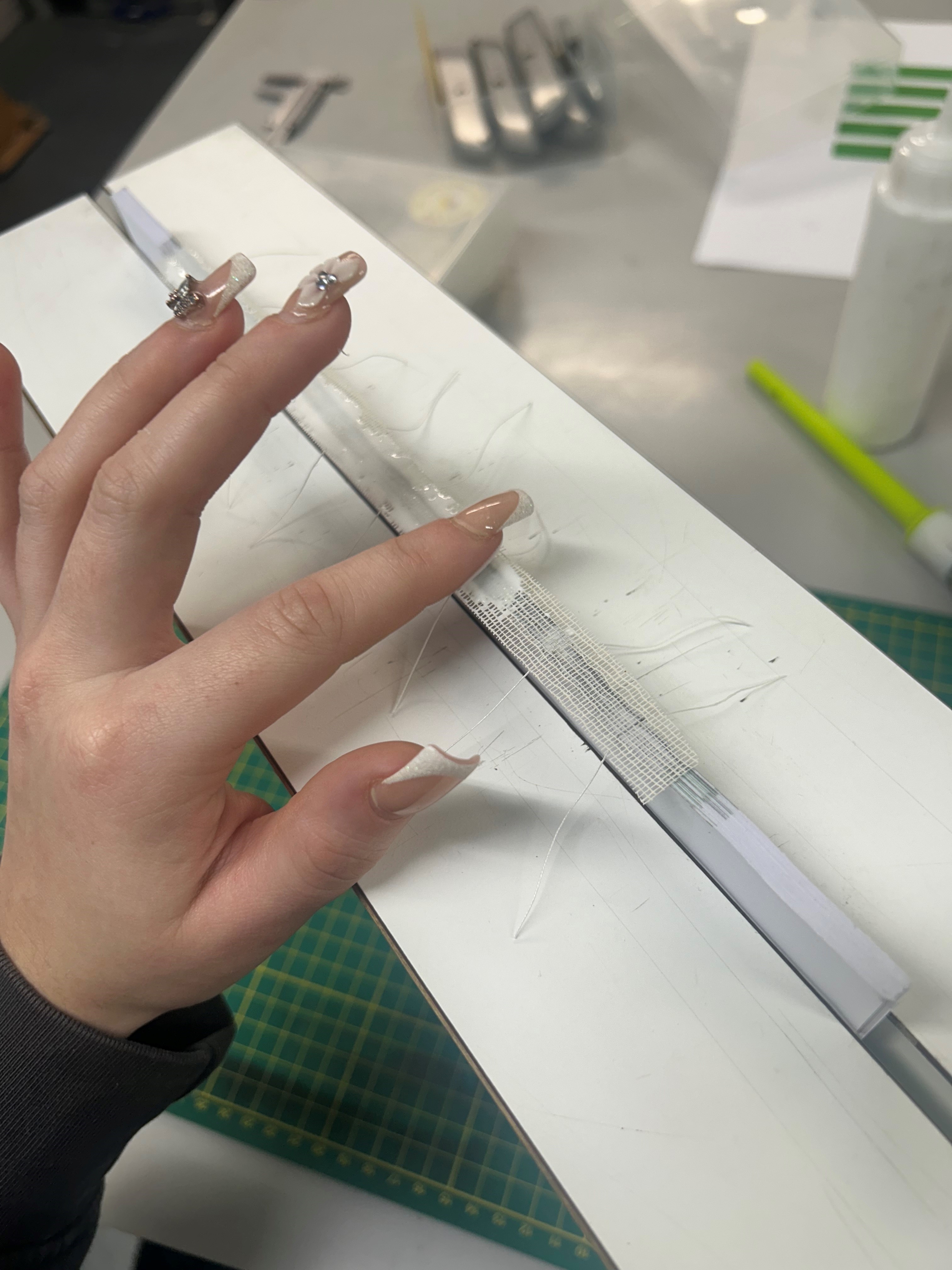
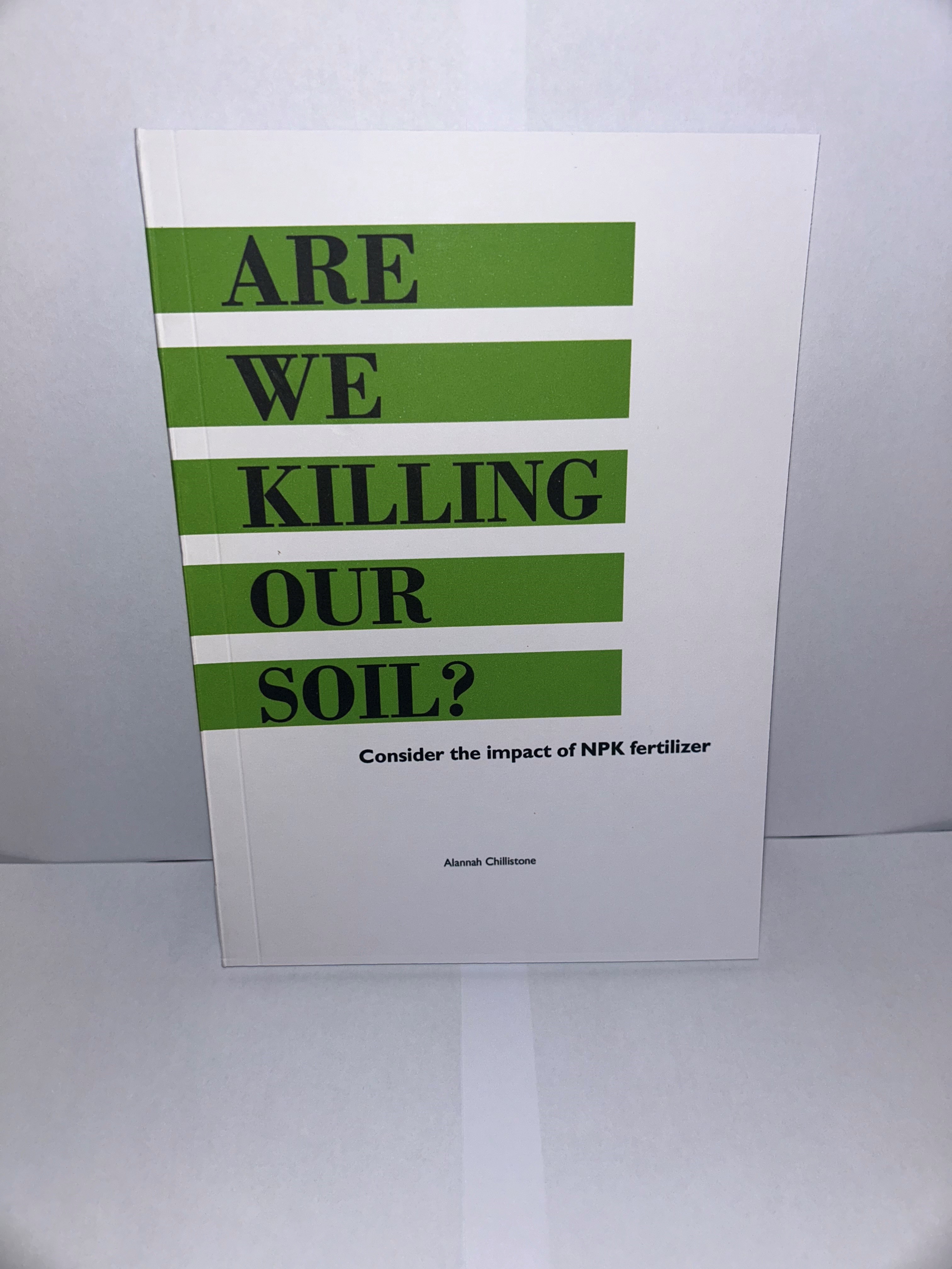
I recently printed my process book for my Post-Growth project, which includes all the work I've done throughout the process. To make it even better, I took an additional workshop to learn how to professionally bind my book. This was such an exciting new skill to pick up, and I found the whole process fascinating. The final result is something I'm really proud of – from the high-quality print to the polished, professional binding, the book turned out looking amazing.
While the workshop seemed straightforward, it turned out to be a bit time-consuming because of the waiting periods for the glue to dry. However, I found the entire experience incredibly rewarding. I'm grateful for the opportunity to learn professional printing and binding techniques, especially since the workshop had limited space, making it a rare and special chance to develop this skill.