Zine
How to stay sane
A creatively quirky magazine crafted to shine a light on the often-overlooked struggles of those battling eating disorders. Through its bold design and thought-provoking content, it aims to raise awareness, spark conversation, and offer support to those navigating this difficult journey.
The challenge
I’ll draw inspiration from the text in How to Be Sane to shape the magazine's design, creating visuals that capture and enhance the themes and emotions woven into each page. By carefully crafting imagery, typography, and layouts, I aim to bring the content to life in a way that deeply resonates with readers. The design will not only complement the narrative but also guide them on an immersive journey, using striking visuals and thoughtful layouts to amplify the emotional impact of every page.
Initial ideas
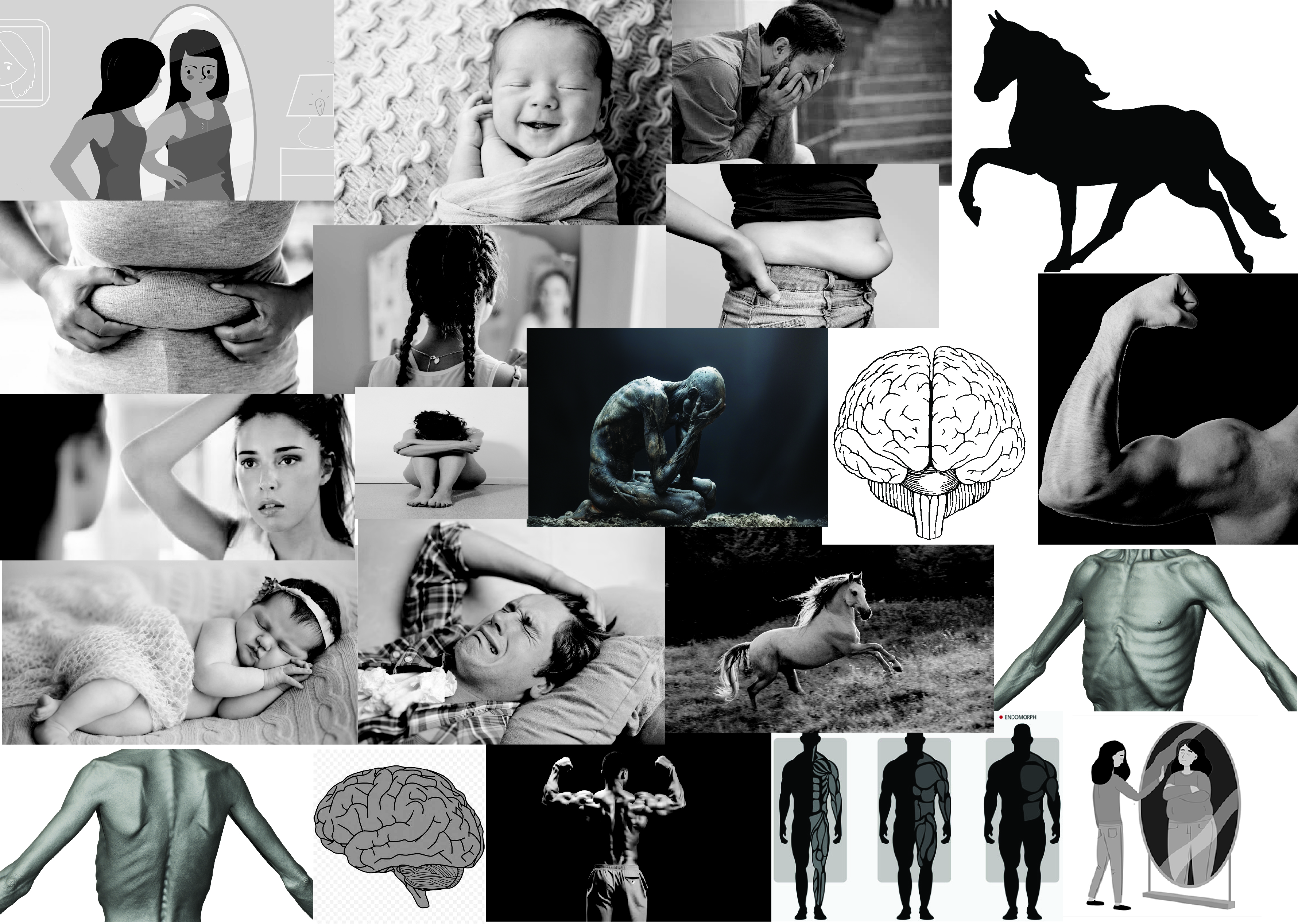
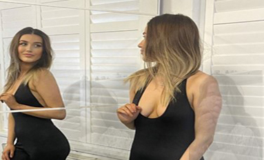
I wanted to mainly focus on the type of imagery I used as it needed to be clear and link to the writing on the page. I decided using black and white imagery as it presents the idea of it being dark and sad, this also helped the typography to stand out clearer. For the images I will be using all my own photos.
Our context
My primary target audience is individuals aged 20-35, but the magazine is open to anyone affected by eating disorders. The imagery is raw and sometimes graphic, reflecting the harsh reality of how eating disorders can impact the body. This visual approach is deeply influenced by the text I’ve used, aiming to shed light on the often-hidden effects of these struggles.
The magazine will be available in places like doctors’ offices, on store shelves, and distributed by medical professionals. Its purpose is to provide a powerful, visual representation of the diverse ways eating disorders manifest, showing that everybody tells a different story.
Initial experiments
I began by breaking down the text into key phrases and identifying the most impactful lines to guide the page design. This process helped me choose the right imagery and pinpoint the phrases that would capture the reader’s attention and draw them into the story. By focusing on these crucial elements, I was able to create a design that not only reflects the message but also emotionally connects with the audience.
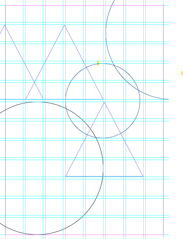
Grids
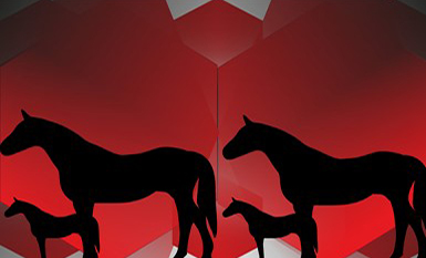
I explored various grid structures for my magazine layout, using geometric shapes and grids to organize the content. This framework served as the foundation for the page, with a central focus that draws the reader’s attention. The grid helped establish a clear starting point, guiding the overall design and ensuring the page maintains balance and visual flow as it develops.
Further experiments
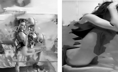
I began by experimenting with different photo edits to see what would work best for the layout. By layering multiple images, I quickly realized it made the pages feel too crowded and overwhelming. The key word of each page guided the image treatment: I blurred some, adjusted their opacity, and played with darkness to create different moods. I found that a lighter opacity worked well for pages with dense text, keeping the focus on the content, while darker images made certain pages stand out more and draw the reader’s eye.
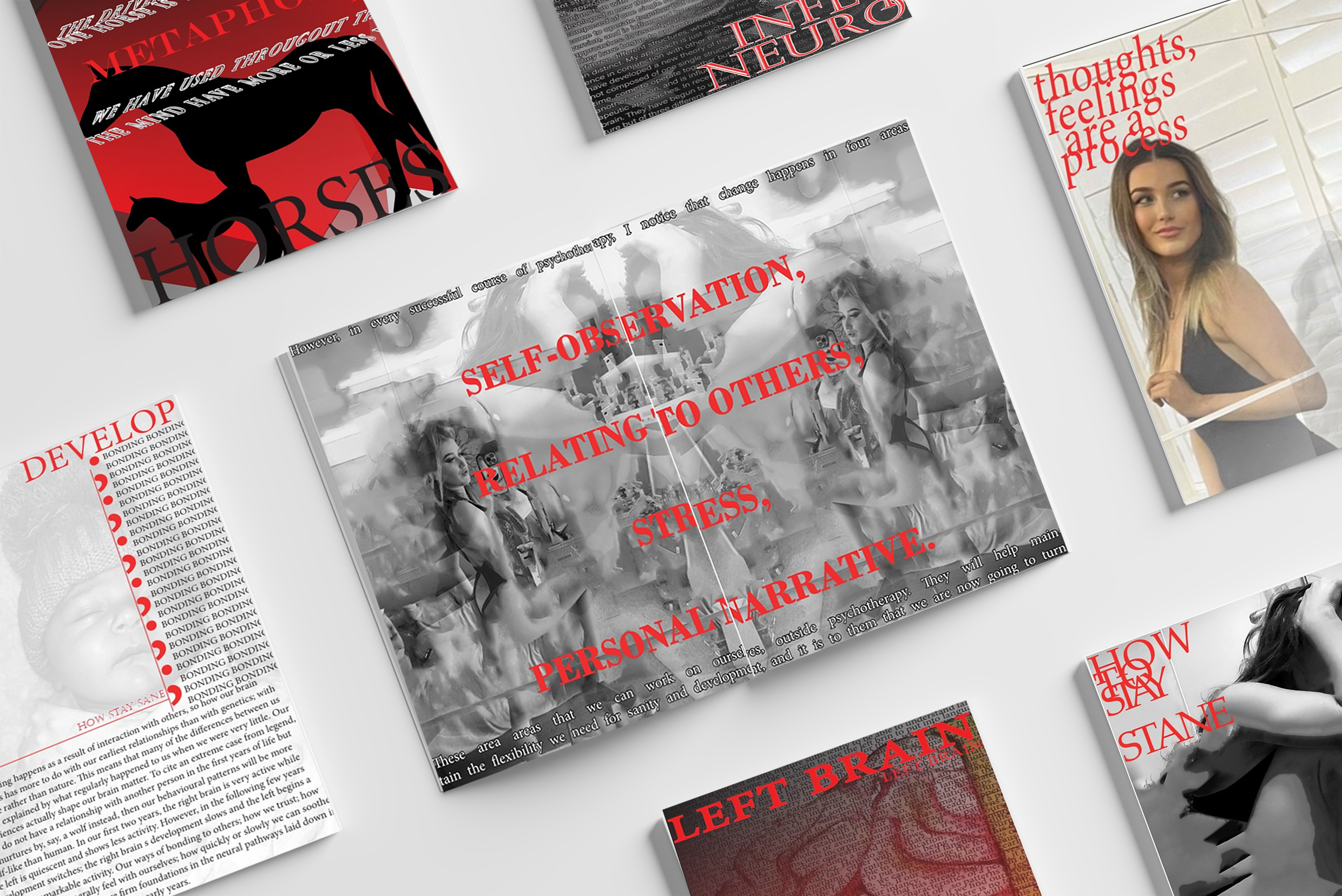
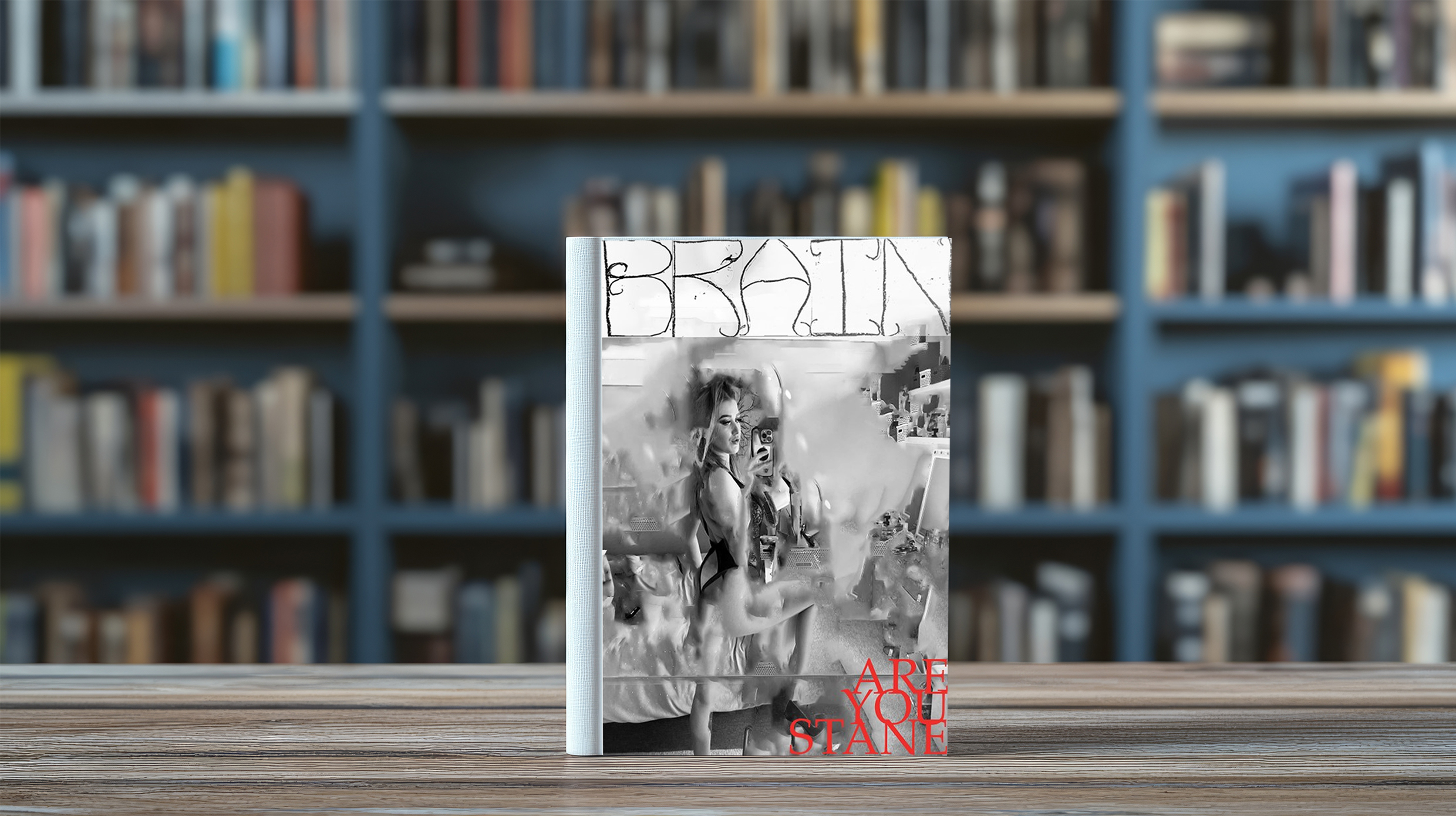
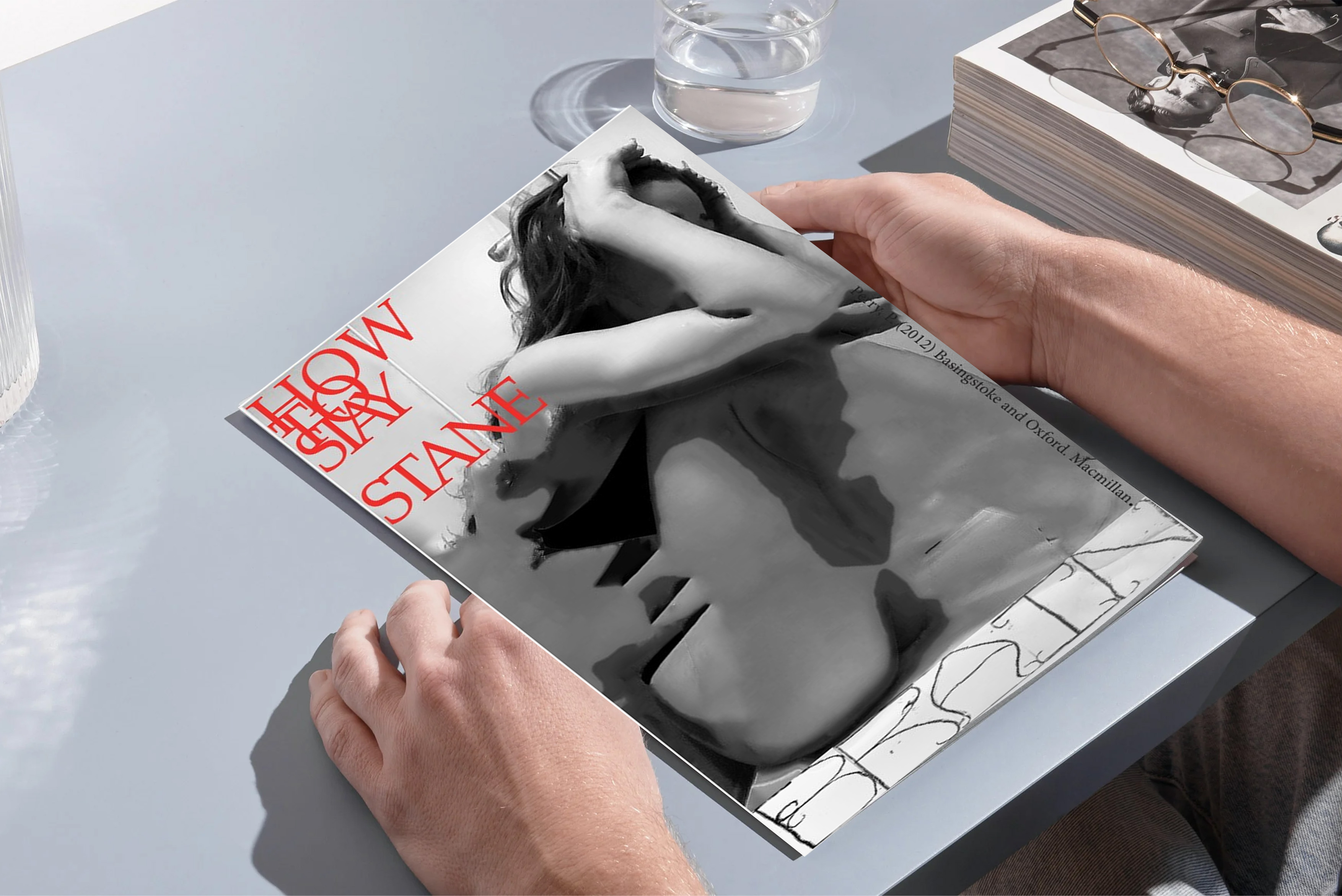
Outcome
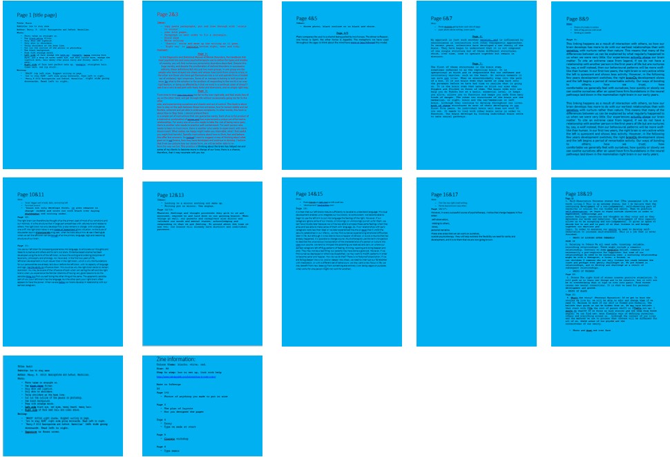
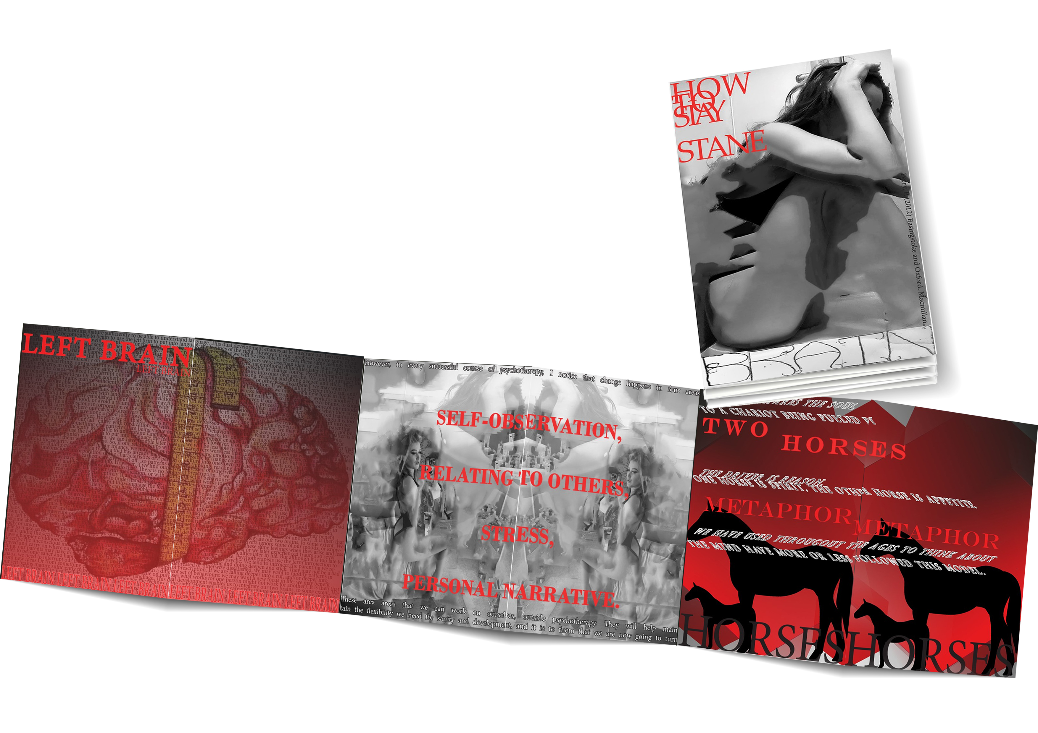
Here is the outcome of my magazine, showcasing the design of each page. While I’m pleased with the result, if I had more time, I would have loved to further explore and refine my skills to enhance the pages even more. There are still areas where I could experiment with new techniques and push the design further to create an even more impactful visual experience.
Reflection
I believe my magazine effectively complemented the written text, aligning well with the overall concept. However, upon reflection, I wish I had focused more on the typography to make it more engaging and visually striking for the target audience. Typography is a powerful tool in design, and I feel I could have pushed it further to add more depth and interest to the pages.
While my primary focus was on image selection and editing, I also wanted to explore new Photoshop techniques to enhance the visual impact. Through this project, I gained valuable skills, especially in working with grids and aligning text, which is something I hadn't fully explored before. This project also marked my first time using InDesign, which was both challenging and exciting. It presented a steep learning curve, but I’m proud of how I navigated it to create a cohesive magazine layout.
One of the most rewarding aspects of this process was experimenting with images and realizing how much they influence the overall presentation of the magazine. I learned how to manipulate images to create different effects, and how important they are in conveying the message visually.
If I had the chance to do it again, I’d like to create a more polished, professional-looking magazine to compare the differences. I also realized that I’m not a fan of overly quirky designs, as I prefer my work to be cleaner and more structured.